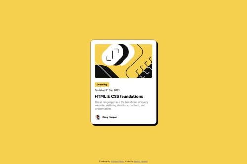
Blog Preview Card Solution

Solution retrospective
I'm proud of the fast guideline I could do in HTML, also about clarity with styles in CSS. Different from my first submmit, I checked better the Figma file, making easy to figure out separations and number parameters.
What challenges did you encounter, and how did you overcome them?At the beggining, I encountered problems with font import, but after some research, I could make it work. For this project I also tried to improve my coding environment, so I searched for some information about formats and so on. Finally, I was able to make some configurations to facilitate next projects coming.
What specific areas of your project would you like help with?Again, I would like to receive advices about CSS code and what is the better way to structure this file.
Please log in to post a comment
Log in with GitHubCommunity feedback
No feedback yet. Be the first to give feedback on Beatriz Manrique's solution.
Join our Discord community
Join thousands of Frontend Mentor community members taking the challenges, sharing resources, helping each other, and chatting about all things front-end!
Join our Discord