Submitted over 1 year agoA solution to the Blog preview card challenge
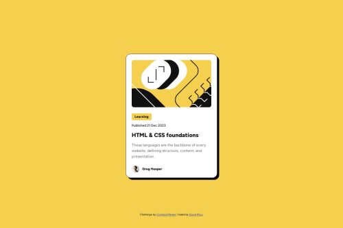
Blog preview card
sass/scss

@davidkhuu
Solution retrospective
What are you most proud of, and what would you do differently next time?
Proud of adding the responsive design for mobile screens.
Next time I'd like to look into a less repetitive way to handle it.
What challenges did you encounter, and how did you overcome them?Finding the correct syntax for handling different media sizes. Google was a handy resource to figure it out.
What specific areas of your project would you like help with?There is most likely a less repetitive way to handle a mobile screen size than what I did. Do you know of a way or do you have a link to a resource I can read up on?
Code
Loading...
Please log in to post a comment
Log in with GitHubCommunity feedback
No feedback yet. Be the first to give feedback on David Khuu's solution.
Join our Discord community
Join thousands of Frontend Mentor community members taking the challenges, sharing resources, helping each other, and chatting about all things front-end!
Join our Discord