Not Found
Not Found
Not Found
Not Found
Not Found
Not Found
Not Found
Not Found
Not Found
Not Found
Not Found
Not Found
Not Found
Not Found
Not Found
Not Found
Not Found
Not Found
Not Found
Not Found

Submitted

Blog preview card solution - using flexbox

ayx 40

@ayx234

Desktop design screenshot for the Blog preview card coding challenge

This is a solution for...

  • HTML
  • CSS
1newbie
View challenge

Design comparison


SolutionDesign

Solution retrospective


What challenges did you encounter, and how did you overcome them?

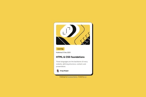
The article's image stretches vertically on the mobile version of the design. I searched for a dynamic solution and was introduced to CSS aspect-ratio.

Github didn't initially show the images or the correct font because I used src="/folder-name.../" Github needs a dot before the forward slash for relative paths src="./folder-name/..."

What specific areas of your project would you like help with?

  • How do I make my HTML more semantic and accessible ?
  • How can I improve my CSS ?

Community feedback

Huy Phan 1,360

@huyphan2210

Posted

Hi, @ayx234

I took a look at your solution and have some thoughts:

  • Semantic HTML: I think your .card could be an article element, or you could make the card itself the main element instead of using main as a wrapper. Also, the .attribute section might work better as a footer element below the main rather than a div inside it.
  • CSS: You've done a great job styling the card! My recommendation would be to reorganize your CSS file. Consider placing @font-face at the beginning and moving all @media queries to the end. I also noticed that you're styling the body in two places, so merging those would improve clarity.

Hope this helps!

0

Please log in to post a comment

Log in with GitHub
Discord logo

Join our Discord community

Join thousands of Frontend Mentor community members taking the challenges, sharing resources, helping each other, and chatting about all things front-end!

Join our Discord