Submitted about 1 month ago
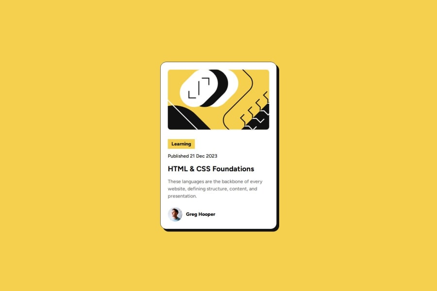
Blog Preview Card [ SEMANTIC MARKUP + VANILLA CSS + FLEXBOX + RESPO
#accessibility#bem#pure-css

@FakeyeTami

Design comparison
SolutionDesign

Solution retrospective
What are you most proud of, and what would you do differently next time?
- Successfully built a clean and accessible blog preview card.
- Used CSS variables to maintain consistent colors and typography.
Had trouble aligning it properly but fixed it by setting align-self: flex-start;.
- I’d love feedback on reducing font sizes and spacing for better responsiveness—I’m not very confident in responsive design.
- Any tips on making box shadows look cleaner? Also, how does my code look overall?
Community feedback
- @NovicksPosted about 1 month ago
In general, your code is well structured, I don't think there is much to worry about responsiveness, as your solution is very responsive, good work!
0

Please log in to post a comment
Log in with GitHubJoin our Discord community
Join thousands of Frontend Mentor community members taking the challenges, sharing resources, helping each other, and chatting about all things front-end!
Join our Discord