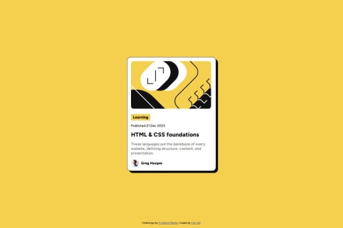
Submitted over 1 year agoA solution to the Blog preview card challenge
Blog preview card
accessibility
@Cxx-mlr

Solution retrospective
What are you most proud of, and what would you do differently next time?
I was able to complete this project efficiently without running into any challenges. In the future, I’d like to explore using Tailwind CSS and React to enhance the implementation.
What challenges did you encounter, and how did you overcome them?Fortunately, I didn’t encounter any obstacles during the process.
What specific areas of your project would you like help with?I would appreciate any feedback on potential improvements. If you have suggestions for refining the project, they would be greatly valued.
Code
Loading...
Please log in to post a comment
Log in with GitHubCommunity feedback
No feedback yet. Be the first to give feedback on Santiago Papiernik's solution.
Join our Discord community
Join thousands of Frontend Mentor community members taking the challenges, sharing resources, helping each other, and chatting about all things front-end!
Join our Discord