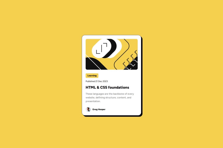
Design comparison
Solution retrospective
I'm most proud of achieving a clean, responsive design that closely matches the provided mockup from Frontend Mentor. My use of CSS Flexbox for layout adjustments helped maintain visual consistency across different screen sizes. Next time, I'd like to incorporate more interactive elements such as hover effects and possibly a dark mode toggle to enhance the user experience and make the card more dynamic.
What challenges did you encounter, and how did you overcome them?One of the main challenges was ensuring the text overlay didn't overlap or become unreadable on smaller screens. This required careful manipulation of CSS properties like padding and font-size. I overcame this by using media queries to adjust these properties dynamically based on the screen size, ensuring readability and aesthetic appeal were maintained across devices.
What specific areas of your project would you like help with?I would appreciate feedback on the efficiency of my CSS, particularly if there are more streamlined ways to apply media queries or if my use of Flexbox could be optimized. Also, tips on implementing accessibility features would be very helpful, as I want to ensure that the card is fully accessible to all users.
Community feedback
- @sharms-myPosted 12 months ago
Good job finding a solution on responsive font-size with media queries. One thing I could suggest for you to check is the css clamp function. It would take 3 parameters; minimum value, preferred value, and maximum value. If you would set your preferred value to a viewport, font-size would scale depending on the size of the viewport. I haven't personally used it but you can try incorporating it to your solutions for a responsive design.
Marked as helpful0
Please log in to post a comment
Log in with GitHubJoin our Discord community
Join thousands of Frontend Mentor community members taking the challenges, sharing resources, helping each other, and chatting about all things front-end!
Join our Discord
