

Design comparison

Solution retrospective
Was able to make my card mobile responsive
What challenges did you encounter, and how did you overcome them?Responsiveness of the card on mobile devices
What specific areas of your project would you like help with?Could my code be reviewed? i made use of margins a couple and i'm trying to look for a better way to handle it
Community feedback
- @LouckoomPosted 3 months ago
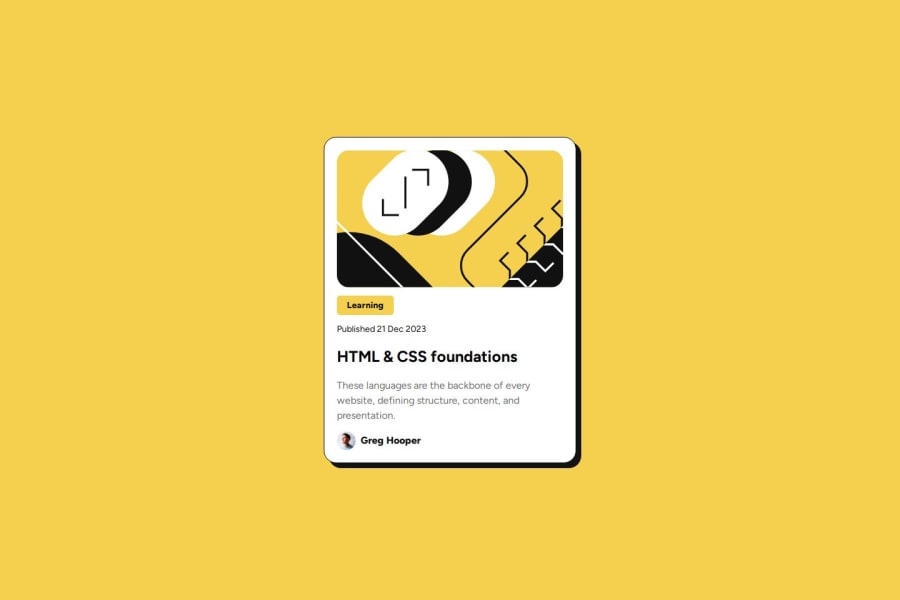
hey, that great, i kind of scroll thought your HTML & CSS files, maybe be you could decrease your padding top of your Main div, also maybe decrease a little the width and height of that "Greg Hooper" image/avatar and finally increase the font weight of your Learning button and also "Greg Hooper" paragraph. Except from that congrat on your code ! it's very well organized.
Marked as helpful0@Ekene001Posted 3 months ago@Louckoom okay thanks so much for the corrections. I'll make the changes
1

Please log in to post a comment
Log in with GitHubJoin our Discord community
Join thousands of Frontend Mentor community members taking the challenges, sharing resources, helping each other, and chatting about all things front-end!
Join our Discord