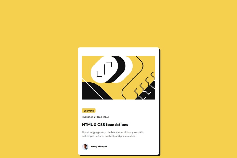
Design comparison
SolutionDesign
Solution retrospective
What are you most proud of, and what would you do differently next time?
I am most proud that it did not take me hours. Usually, I need help remembering how to do things in CSS that I spend lots of time googling. But I did not have to Google a single thing: progress.
What challenges did you encounter, and how did you overcome them?Some text sizing was off with the Figma design and style sheet. I used what I thought was natural for the look.
What specific areas of your project would you like help with?I am confident that I provided the best code for this one to the best of my knowledge. However, I am always looking for feedback to help me improve my Front-End Development.
Community feedback
Please log in to post a comment
Log in with GitHubJoin our Discord community
Join thousands of Frontend Mentor community members taking the challenges, sharing resources, helping each other, and chatting about all things front-end!
Join our Discord
