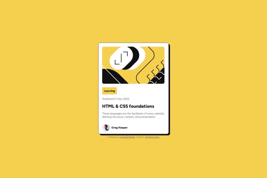
Design comparison
SolutionDesign
Solution retrospective
What are you most proud of, and what would you do differently next time?
I was able to use the CSS Flexbox more comfortably.
What challenges did you encounter, and how did you overcome them?The biggest challenge I had was the relative path to my images and fonts. It worked in the localhost, but not production. I was able to compare the relative path with existing code, and make the necessary changes.
Please log in to post a comment
Log in with GitHubCommunity feedback
- @josephj97
Overall, great work from your side on this page but I have few comments
- I think you should have added descriptive alt attribute to your image.
- The media query is well-used. However, the .card-container img:first-child selector could be clearer. The image could be given a class like .card-image for easier targeting.
- I think that the font size should be larger for readability (like 100%)
Good work!! Keep it up
Join our Discord community
Join thousands of Frontend Mentor community members taking the challenges, sharing resources, helping each other, and chatting about all things front-end!
Join our Discord
