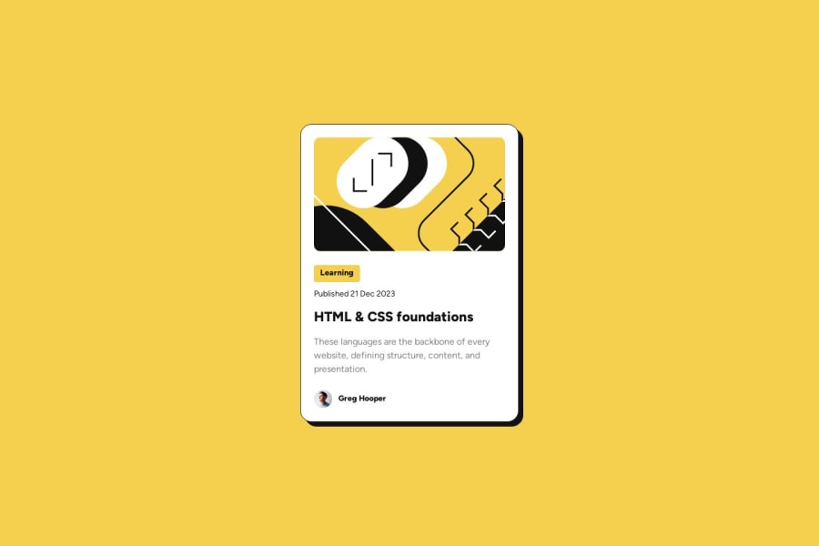
Blog Preview Card - Responsive font without media queries


Design comparison

Solution retrospective
I am pleased it works on both desktop and mobile with respectable accuracy. I was also happy about noticing the dropshadow effect on hover and having to google to find a solution (that being the has pseudo class).
As far as differences, if I had to do it again, I would probably experiment with different markup and/or layout strategies--specifically adding an addition wrapper type div and experimenting with a 3 column grid layout or possibly sub-grid. I'd also like to do more mobile first development.
What challenges did you encounter, and how did you overcome them?The font scaling, understanding the CSS math functions. Kept breaking the layout. Got a little more comfortable with Figma, Firefox Dev Tools, and VisBug. Watched several videos on responsive fonts without media queries. Persistence, research, and experimentation paid off.
What specific areas of your project would you like help with?Would it have been better to implement the instructor avatar as a ::before element? Why or why not, or just a matter of taste?
My use of the hgroup tag... appropriate? Unnecessary? Or maybe you would have used it, but differently. (removed: no longer relevant)
Any other semantic elements that were used inappropriately or some that I missed an opportunity to leverage?
Community feedback
Please log in to post a comment
Log in with GitHub
Join our Discord community
Join thousands of Frontend Mentor community members taking the challenges, sharing resources, helping each other, and chatting about all things front-end!
Join our Discord