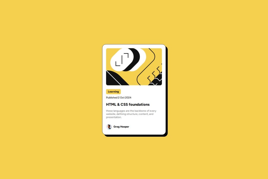
Blog Preview Card: Responsive Design with HTML5 and CSS3
Design comparison
Solution retrospective
What I'm most proud of
I'm particularly proud of implementing a clean and responsive design using Flexbox and CSS custom properties. The use of variables for colors and spacing ensures consistency throughout the design and makes future updates easier.
What I'd do differently next time
For future projects, I'd consider:
- Implementing CSS Grid for more complex layouts
- Adding subtle animations to enhance user interaction
- Using a CSS preprocessor like Sass for more efficient styling
- Incorporating accessibility features from the start
- Setting up a basic build process for optimizing assets
Responsive image handling: I tackled this by using object-fit: cover on the card image, ensuring it looks good at different sizes.
What specific areas of your project would you like help with?1.CSS optimization: Are there ways to further improve the DRYness of my CSS, particularly in the card styling?
2.Accessibility: How can I enhance the accessibility of the blog preview card, especially for screen readers?
3.Responsive design: While the card has a fixed width, are there improvements I could make to ensure it displays well across all device sizes?
4.Performance: Are there any optimizations I could implement to improve the loading speed of the card, particularly regarding the image?
5.Interactive elements: Besides the hover effect on the title, are there other interactive elements I could add to improve user engagement without compromising the clean design?
Community feedback
- @StroudyPosted about 2 months ago
Exceptional work! You’re showing great skill here. I’ve got a couple of minor suggestions that could make this stand out even more…
- These
<div>should really have semantic tags like headings (<h1> to <h6>) and paragraphs (<p>) convey structure and meaning to content, improving accessibility, SEO, and readability by helping search engines and screen readers interpret the content.
<div class="card-badge">Learning</div> <div class="card-date">Published 2 Oct 2024</div>-
Using a full modern CSS reset is beneficial because it removes default browser styling, creating a consistent starting point for your design across all browsers. It helps avoid unexpected layout issues and makes your styles more predictable, ensuring a uniform appearance on different devices and platforms, check out this site for a Full modern reset
-
I think you can benefit from using a naming convention like BEM (Block, Element, Modifier) is beneficial because it makes your CSS more organized, readable, and easier to maintain. BEM helps you clearly understand the purpose of each class, avoid naming conflicts, and create reusable components, leading to a more scalable codebase. For more details BEM,
-
For future project, You could download and host your own fonts using
@font-faceimproves website performance by reducing external requests, provides more control over font usage, ensures consistency across browsers, enhances offline availability, and avoids potential issues if third-party font services become unavailable. Place to get .woff2 fonts
I hope you’re finding this guidance useful! Keep refining your skills and tackling new challenges with confidence. You’re making great progress—stay motivated and keep coding with enthusiasm! 💻
Marked as helpful0 - These
Please log in to post a comment
Log in with GitHubJoin our Discord community
Join thousands of Frontend Mentor community members taking the challenges, sharing resources, helping each other, and chatting about all things front-end!
Join our Discord
