Not Found
Not Found
Not Found
Not Found
Not Found
Not Found
Not Found
Not Found
Not Found
Not Found
Not Found
Not Found
Not Found
Not Found
Not Found
Not Found
Not Found
Not Found
Not Found
Not Found

Submitted

Blog Preview Card (React and Tailwind)

Justin Levyā€¢ 100

@justinsane

Desktop design screenshot for the Blog preview card coding challenge

This is a solution for...

  • HTML
  • CSS
1newbie
View challenge

Design comparison


SolutionDesign

Solution retrospective


What are you most proud of, and what would you do differently next time?

I'm most proud of coding this component fairly quickly.

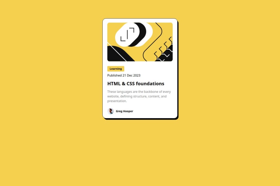
What challenges did you encounter, and how did you overcome them?

I slowed down when attempting to style the 'Learning' heading with a background color. Originally I used an h3 element but realized I needed to use a span so the background color wouldn't stretch the entire width of the div. I learned the difference between block elements (most common) and inline elements (like span). The solution was to use inline-block Tailwind CSS.

What specific areas of your project would you like help with?

I could use more help translating the Figma design to css, specifically how to use 'rem' and the association with Tailwind classes.

Community feedback

Daniel šŸ›øā€¢ 44,230

@danielmrz-dev

Posted

Hello there!

Congrats on completing the challenge! āœ…

Your project is looking fantastic!

I'd like to suggest a way to make it even better:

  • Using margin and/or padding isn't always the most effective method for centering an element.

Here's a highly efficient approach to position an element at the center of the page both vertically and horizontally:

šŸ“Œ Apply this CSS to the body (avoid using position or margins in order to work correctly):

body {
    min-height: 100vh;
    display: flex; 
    justify-content: center;
    align-items: center;
}

I hope you find this helpful!

Keep up the excellent work!

Marked as helpful

1

Justin Levyā€¢ 100

@justinsane

Posted

@danielmrz-dev Thanks for the feedback. This is a really helpful tip for this project and others!

Tailwind CSS in my app.css file

:root {
  @apply flex flex-col justify-center items-center min-h-screen;
}
0
Darkstarā€¢ 1,000

@DarkstarXDD

Posted

Looks good, couple of things you could improve.

  • The "Learning" and the date are not headings. They are paragraphs. So you can use <p>. The <h1> is the only headings in this design.
  • You can directly add the inline-block to the <p> tag (currently you have this as an h2) that contains the "Learning". The <span> is redundant here.
  • To center the entire component on the screen you can use flex or grid. Giving a margin-top is not a proper way to achieve it. Since you are using tailwind it would be flex flex-col justify-center items-center min-h-screen on the root div. You can then remove the margin-top on your component. This way no matter what the screen height is the component will be in the center.

You can convert the px font sizes in the Figma design to rem by dividing the px value by 16. So if the font-size in Figma is 14px, then the rem value would be 14/16 = 0.875. In Tailwind font-sizes are defined in rem so you only need to find the utility class that has the value you are looking for.

Marked as helpful

1

Justin Levyā€¢ 100

@justinsane

Posted

@DarkstarXDD Great feedback, thank you.

I wish it was easier to determine whether text is a heading or paragraph in Figma. I'll have to learn more about Figma.

function App() {
  return (
    <div className='mx-5 max-w-sm md:mx-auto py-5 px-6 rounded-2xl outline outline-1 bg-white box-shadow-container'>
      <img
        src='/illustration-article.svg'
        alt='Blog Image'
        className='mx-auto rounded-xl'
      />
      <p className='text-sm font-bold inline-block bg-yellow py-1 px-3 rounded mt-6'>
        Learning
      </p>
      <p className='text-medium mt-2'>Published 21 Dec 2023</p>
      <a href=''>
        <h1 className='font-bold text-2xl mt-3 leading-9'>
          HTML & CSS foundations
        </h1>
      </a>
      <p className='text-grey text-md mt-3'>
        These languages are the backbone of every website, defining structure,
        content, and presentation.
      </p>
      <div className='flex flex-row items-center mt-6'>
        <img src='image-avatar.webp' alt='Avatar Image' className='w-8 ' />
        <p className='font-bold text-sm ml-3 leading-tight'>Greg Hooper</p>
      </div>
    </div>
  );
}
0

Please log in to post a comment

Log in with GitHub
Discord logo

Join our Discord community

Join thousands of Frontend Mentor community members taking the challenges, sharing resources, helping each other, and chatting about all things front-end!

Join our Discord