Solution retrospective
What are you most proud of, and what would you do differently next time?
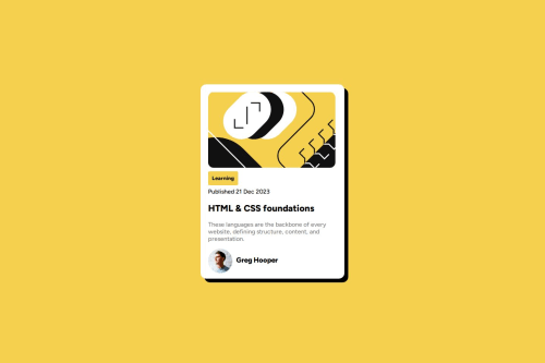
I'm most proud of how close I got this challenge to the design provided, I did do this over a couple of days and next time I would rather just get it done on the same day.
What challenges did you encounter, and how did you overcome them?I faced an issue with making my solution responsive and after multiple attempts I finally got it to work with the help of the dev console.
Code
Loading...
Please log in to post a comment
Log in with GitHubCommunity feedback
No feedback yet. Be the first to give feedback on RKennedyy's solution.
Join our Discord community
Join thousands of Frontend Mentor community members taking the challenges, sharing resources, helping each other, and chatting about all things front-end!
Join our Discord