Design comparison
SolutionDesign
Solution retrospective
What are you most proud of, and what would you do differently next time?
I'm proud of mastering flexbox for the first time, and next time, I'll try to use rem and em more often.
What challenges did you encounter, and how did you overcome them?I had some trouble with a media query at the end. The image inside the container didn't resize correctly, but I fixed it by setting the image's width to 100%.
What specific areas of your project would you like help with?None
Community feedback
- @SvitlanaSuslenkovaPosted about 2 months ago
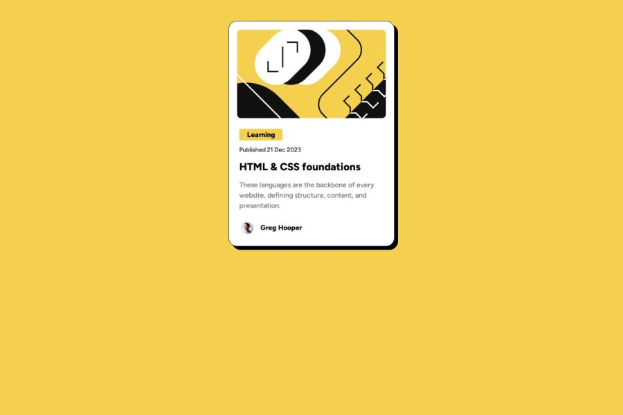
body { display: flex; flex-direction: column; justify-content: center; align-items: center; min-height: 100vh; } Try this to align(top-bottom) and justify(left-right) your project to the center. It applies to the parent component(body), don't forget about !!min-height!!. You can use grid instead of flex too.
Marked as helpful0
Please log in to post a comment
Log in with GitHubJoin our Discord community
Join thousands of Frontend Mentor community members taking the challenges, sharing resources, helping each other, and chatting about all things front-end!
Join our Discord
