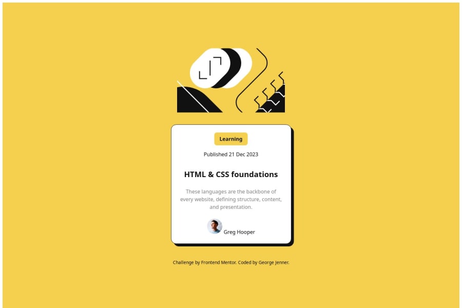


Design comparison

Please log in to post a comment
Log in with GitHubCommunity feedback
- P@Stroudy
Exceptional work! You’re showing great skill here. I’ve got a couple of minor suggestions that could make this stand out even more…
-
Avoid using
idselectors for styling in CSS because they are too specific and hard to override, making your styles less flexible and maintainable. Instead, use class selectors (.), which are reusable and more manageable, allowing for better control over your styles and easier updates. -
Using a
<main>tag inside the<body>of your HTML is a best practice because it clearly identifies the main content of your page. This helps with accessibility and improves how search engines understand your content. -
Here you have a
divin adiv, It is unnecessary.
<div class="card-entry-footer"> <div class="entry-author"> <img src="assets/images/image-avatar.webp" alt="author photo"> <span class="byline">Greg Hooper</span> </div> </div>-
Using a full modern CSS reset is beneficial because it removes default browser styling, creating a consistent starting point for your design across all browsers. It helps avoid unexpected layout issues and makes your styles more predictable, ensuring a uniform appearance on different devices and platforms, check out this site for a Full modern reset
-
I think you can benefit from using a naming convention like BEM (Block, Element, Modifier) is beneficial because it makes your CSS more organized, readable, and easier to maintain. BEM helps you clearly understand the purpose of each class, avoid naming conflicts, and create reusable components, leading to a more scalable codebase. For more details BEM,
-
For future project, You could download and host your own fonts using
@font-faceimproves website performance by reducing external requests, provides more control over font usage, ensures consistency across browsers, enhances offline availability, and avoids potential issues if third-party font services become unavailable. Place to get .woff2 fonts
I hope you’re finding this guidance useful! Keep refining your skills and tackling new challenges with confidence. You’re making great progress—stay motivated and keep coding with enthusiasm! 💻
Marked as helpful -
- P@JocelyneTeles98
Nice effort! The detail is that the picture should be inside the card.
You can place it where after the section or div that represent your card is open:
<section class="blog-card"> <img class="illustration" src="assets/images/illustration-article.svg" alt="article illustration" /> [...] </section>And then style it with the width of 100% to occupy the size of the card (remember add padding to the card div or section)
.illustration { border-radius: 10px; width: 100%; }
.blog-card { align-items: center; background-color: #FFF; border-radius: 20px; box-shadow: 8px 8px 0 0 #000; display: flex; flex-direction: column; gap: 24px; margin: 12px; max-width: 384px; padding: 24px; }
I'm sure that there are better solutions than mine but I hope that I helped you with where to start. Wish you a happy coding!
Marked as helpful - @SvitlanaSuslenkova
move flex from div id=page to body. Use class instead of id for css.
Marked as helpful


Join our Discord community
Join thousands of Frontend Mentor community members taking the challenges, sharing resources, helping each other, and chatting about all things front-end!
Join our Discord