

Design comparison

Solution retrospective
I'm happy with my ability to reseacrch solutions and overcome a problem when i hit a roadblock in this project. Next time i would do more commits as i had to start over once when i was half way through, although i appreciate the extra practice.
What challenges did you encounter, and how did you overcome them?I didnt know how to make a child elements property change when i hover over the parent element but after a quick google it all made sense.
What specific areas of your project would you like help with?I'm not confident with my code and even though everything looks good im not sure its good quality so some feedback would be nice.
Community feedback
- @grace-snowPosted 7 months ago
Hi, on this one I see some problems that definitely need addressing. I hope they are helpful.
- Always update the title in the html head.
- The alt text on this image isn't helpful. I think you mean to treat it as a decorative image, in which case the alt should be empty with no spaces
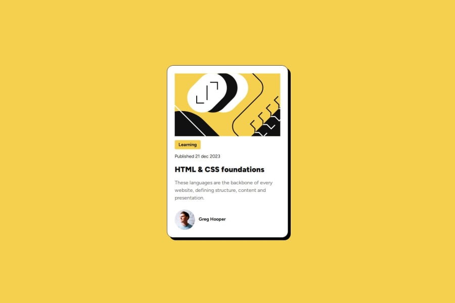
alt="". - It's extremely important to use headings appropriately. That means use headings for heading content and consider the most suitable level of heading. In this, the learning category is definitely not a heading. It's just a paragraph. The heading is the name of the blog. And similar to your previous challenge, this blog title wouldn't be the main page heading in a card like this so you know it must not be a h1.
- Try to remember that text should never be in a div or span alone. There is always a meaningful element available, even paragraph.
- I question if the author image should be treated as meaningful content if it's alt text is only going to repeat the name that immediately follows it. That seems pointless to me. I recommend you read the posts in the resources channel on discord about how and when to write alt text on images.
- Don't limit the height or elements that contain text, including the main landmark. Min-height is fine to use but height is not. As soon as you set a fixed height the browser will do all it can to try and honour your request, even if the content is taller than a mobile screen and has to overflow at the top the browser is just trying to honour that impossible fixed height.
- the component max width should be in rem, just like in the last challenge.
- the component must not have a min width. That is immediately going to make it fail a reflow test because it will overflow some screens. We have to make our solutions work without unnecessary horizontal scroll down to 320px wide. But the crux of the point here is you don't need a min-width and don't add stuff you don't need.
- The component also doesn't need a min-height. Let the browser do it's job and decide what height is needed based on the content inside.
- you shouldn't need flex shrink or flex wrap in this either. Be careful not to bloat css. Every property you leave in must be there for a good reason.
- The category text also must not have a width or height. All it needs is padding, nothing else for sizing.
- Most important of all on this is that you've missed out the core functionality of this component. Note how there is a hover style included in the design, and how the content clearly implies this card is acting as a signpost to a blog elsewhere on a site. That all means it must include a link, inside the heading, wrapping the heading text.
- Once that missing link has been added its your job to make the whole card clickable, not just the link. You can do that by making the card position relative and giving the link a pseudo element that's sized and positioned to cover the card. That effectively extends the link over the whole card so it's all clickable.
As with any challenge that includes an interactive element, make sure you test it with keyboard as well as mouse.
0 - P@djneillPosted 7 months ago
You did a great job and this looks great. Something that can help is using media queries with your CSS, this will target how your CSS will look on different screen sizes. Some other HTML tags may help with readability so instead of having a page full of divs you can use, main, section, article, and aside.
Dave Gray has a YT on media queries - Link
0@grace-snowPosted 7 months ago@djneill this challenge doesn't need a media query so I'm not sure why the feed back has been given here?
0P@djneillPosted 7 months agoThank you for your insight, Grace. My apologies, I was unaware that this particular challenge doesn't require media queries. My feedback was intended as general advice for future projects, but I can see how that might not have been clear. I appreciate you pointing this out, as it's important to keep feedback relevant to the specific task at hand.
1 - @Antonio-RiccelliPosted 7 months ago
Well done on your solution and good on using Flex.
I don't have much feedback except possibly you could store the colours in variables to make them easier to reuse. However, in such a small project it won't impact things negatively.
0


Please log in to post a comment
Log in with GitHubJoin our Discord community
Join thousands of Frontend Mentor community members taking the challenges, sharing resources, helping each other, and chatting about all things front-end!
Join our Discord