Design comparison
SolutionDesign
Please log in to post a comment
Log in with GitHubCommunity feedback
- P@Stroudy
@Tarps240, I’d like to provide some feedback. In past challenges, I noticed you haven't engaged or responded when solutions were submitted. Networking and actively engaging with the community are essential, and I highly encourage you to embrace these practices. They can greatly enhance collaboration and growth.
- @v-sreevidya
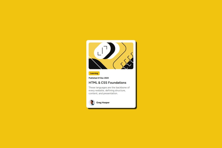
- The colour specifications are given in the starter file which can be used to modify the CSS part.
- Apart from the shadowing feature, the card also has border(black).
- The content is not having the correct alignment as that in the question, which further means that the dimensions of the card is incorrect.
Join our Discord community
Join thousands of Frontend Mentor community members taking the challenges, sharing resources, helping each other, and chatting about all things front-end!
Join our Discord
