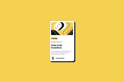
Submitted over 1 year agoA solution to the Blog preview card challenge
Blog preview card project
@LuRamirezR

Solution retrospective
What are you most proud of, and what would you do differently next time?
I feel good about achieving the challenge in less time by applying my knowledge of HTML and CSS.
What challenges did you encounter, and how did you overcome them?I encountered a challenge in this project when I needed to adjust the image using SVG code and also enable the border-radius property. I was able to solve this issue by using a div container and applying the necessary properties to it.
What specific areas of your project would you like help with?I would like to know if the webpage is using semantic HTML, and if there are alternative CSS design solutions I can explore further.
Code
Loading...
Please log in to post a comment
Log in with GitHubCommunity feedback
No feedback yet. Be the first to give feedback on Luisa Fda. Ramirez's solution.
Join our Discord community
Join thousands of Frontend Mentor community members taking the challenges, sharing resources, helping each other, and chatting about all things front-end!
Join our Discord