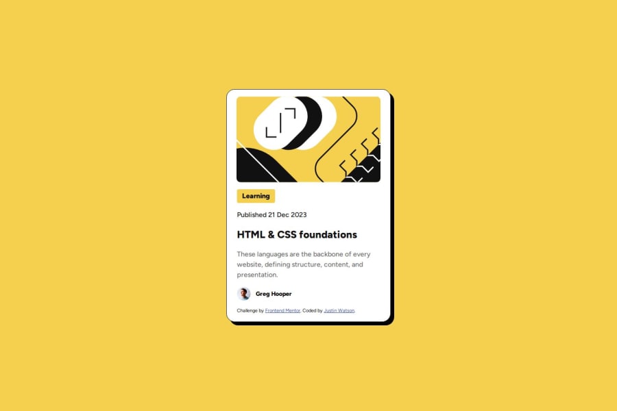
Blog preview card primarily using Flexbox and CSS variables
Design comparison
Solution retrospective
I'm proud of taking it one step at a time and figuring it out on my own as I went along, and just experimenting with things to see how my elements reacted. Next time, I would probably read the style guide md as I didn't realize the code for the variables was already in there, instead of reading from the figma and writing them out myself. But it did help me practice the syntax of doing so.
What challenges did you encounter, and how did you overcome them?The main challenge was making sure all elements had that spacing-200 around them that the figma showed, so that all elements look clean and neat in a column like fashion. I addressed this by realizing that for most elements besides the svg, it was just a matter of adding some spacing to the left of each element.
What specific areas of your project would you like help with?I'd like help with reducing the amount of css written. I feel like there was a cleaner way to space each element than adding margin-left: 1.5rem to every individual element. But i couldn't figure out how to do that in flexbox.
Join our Discord community
Join thousands of Frontend Mentor community members taking the challenges, sharing resources, helping each other, and chatting about all things front-end!
Join our Discord
