

Design comparison

Solution retrospective
Any advice on how to improve html semantics would be appreciated or how to improve in css, thanks :)
Please log in to post a comment
Log in with GitHubCommunity feedback
- @MrDevM
Your project looks very good!
If you give the container a
.card:has( .card-information-title:hover ){
box-shadow: 12px 12px 0px 0px #000;
}
it'll look even closer to the original design.
I hope it helps!
Other than that, great job!
Marked as helpful - @bbsmoothdev
First, great job on this. Looks exactly like the original.
As far as semantics, there is not always one perfect way to code this without knowing the context they are going to be used in. For example, I definitely agree that "HTML & CSS foundations" is a heading, but it would probably not be an
h1. Generally, I think that a group of cards like this would be situated under a heading, which might be anh2, which would make the heading on this card anh3. Again, it depends on the context.Similarly, this card is most likely not going to be the only thing on the page, so you would not want to use a
mainin it. It's a best practice as far as accessibility is concerned to only have onemainon the page. Theheaderandfooteryou can keep if you want since they are inside the "real"maintag, but they are not necessary. Since these cards are meant to stand alone on their own, you could probably wrap them in anarticle.Now the fun part. Forget about the visual design of this card for a moment. If you couldn't see the information in that card but instead could only listen to it being read, don't you think it would make a little more sense to first hear the heading, and then the category, published date, and content? Especially if you had to listen to several of these cards in a row. For example, if you heard "Heading: HTML & CSS foundations" and then a bunch of information after that, you could assume that all of that information was related to "HTML & CSS foundations". And then as you continue to listen you heard "Heading: JavaScript Fundamentals", you would know that you are starting a different card and all of the information that followed would be for that new card. In other words, the heading defines when the card begins and all of the other information on the card follows after the heading.
What I'm describing above is how a blind person using a screen reader would interact with your card. A solid heading structure and logical DOM order is one of the most important things you can do to ensure screen reader users can understand your page. Of course, the DOM order I just described does not match what you see on the page. Visually, the category and published date come before the heading, but as we just discussed, they should come after the heading in the DOM. This is where CSS comes in. You can use CSS to visually reorder these things on the page but still keep them in a more logical DOM order. So that's what I would recommend here. But please don't take this to mean I am encouraging you to visually re-order DOM items willy-nilly. No, quite the opposite, you want to try to avoid it at all costs. But there are a few specific scenarios where it is considered acceptable for accessibility's sake, and this is probably one of them. Of course, the designer of this card could have also taken accessibility into account and not put this information before the heading in the first place. But we should probably give them a break, after all, they're just designers. (I keed).
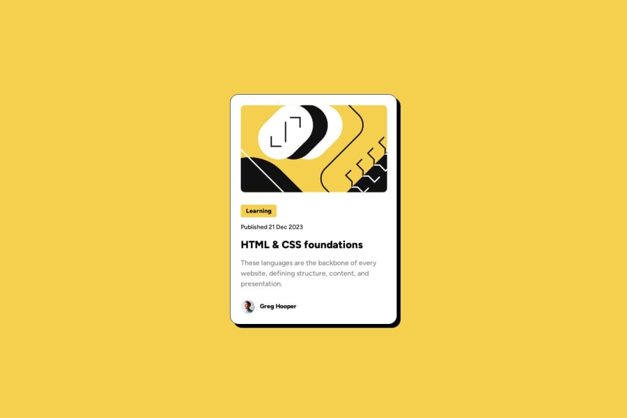
As for the image at the top, to me this image looks purely decorative and should be hidden from screen reader users completely by using an empty
altattribute (alt=""). In this case it would not matter where you put the image in the DOM order. But if the image weren't decorative and it actually needed alt text, then just like the category and published date, it would need to be moved below the heading in the DOM and visually moved with CSS. Where would you move it? I'd probably put it right after the heading.As for the category "tag", we don't know since we only have this one card, but often there is a chance that there could be more than one category for a card and thus you would want to put them in a list. It would probably be helpful to provide a heading for them as well so that screen reader users know exactly what they are for. You can visually hide the heading with CSS. But if there is only ever going to be one category per card then you could probably get away with adding some visually hidden text in front of the category text so it announces as "category: Learning" to screen reader users.
The person image at the bottom is probably decorative as well, so give it empty alt text too. The name at the very end could potentially be placed above the actual content, since usually most articles list the author before the content. But I don't think it is required. I think a screen reader user will probably realize that this is the author of the article. You could potentially add some visually hidden text before the name, such as "written by " but that may be overkill. One thing you don't want to get into the habit of doing is trying to help too much by adding a bunch of extra hidden text just for screen reader users. Any hidden text you add should be very concise and only when you feel it is absolutely necessary to help screen reader users understand your content. And of course the best thing you can do is ask people who use screen readers what they think.
And for sure, what I've written above may not be 100% correct. I'm basing it on general best practices and experience working with screen reader users, but there often is no one perfect solution for everyone. Accessibility is a continuous process. Do your best to make your product accessible, let people test it, accept the feedback graciously, and modify as needed based on that feedback. And then start the cycle over again.
Who knew a simple card could be so complex?


Join our Discord community
Join thousands of Frontend Mentor community members taking the challenges, sharing resources, helping each other, and chatting about all things front-end!
Join our Discord