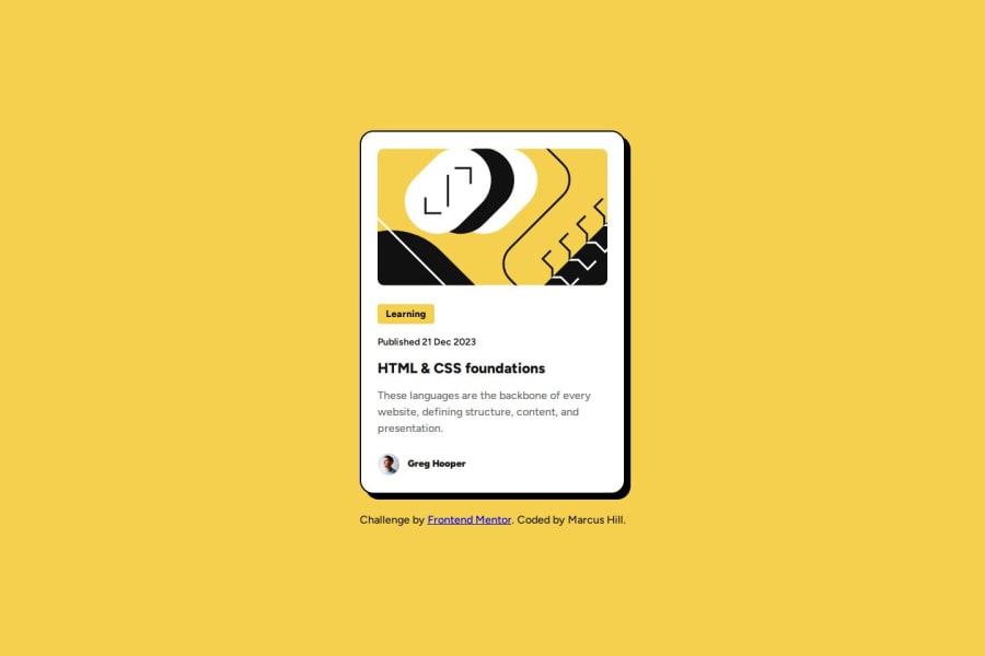
Design comparison
Solution retrospective
Started to use Figma this time, using it as a tool to get information on border radius, padding, element sizes and everything - so hopefully this has shown positively in the design. I have converted pixels to rem and used that to size the main blog card, however I am still learning with CSS units and working out when best to use them.
What challenges did you encounter, and how did you overcome them?The only challenge I encountered was positioning the author's name at the bottom central virtually, in line with the photo of the author. In the end, I utilised Flex box to do this.
What specific areas of your project would you like help with?I would like help with my use of CSS units and overall design responsiveness, whether I have used the correct units in the right places and also made it as responsive as possible.
Community feedback
Please log in to post a comment
Log in with GitHubJoin our Discord community
Join thousands of Frontend Mentor community members taking the challenges, sharing resources, helping each other, and chatting about all things front-end!
Join our Discord
