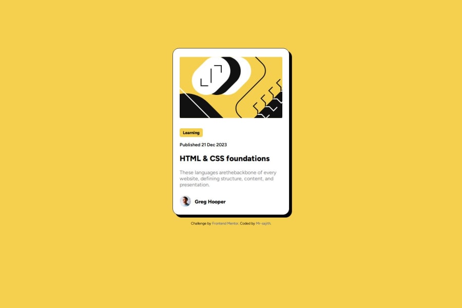
Design comparison
Solution retrospective
-
I am proud of to complete my second project.
-
Next time, I will do better then privious projects.
I have done that project's actual desktop version but when I code media query to mobile version, I struggled to make.
What specific areas of your project would you like help with?I don't know to say that
Community feedback
- @grace-snowPosted about 1 year ago
This needs a lot of the same changes as I fed back on your social links solution just now.
A few different ones for this though:
- all content should be contained within landmarks. This needs a main to wrap the component and a footer for the attribution.
- if using inline svgs you must decide if the image is meaningful or decorative just like you would with an img element and deciding how to treat the alt attribute. The way you handle that difference is different with inline svgs though as they don't accept the alt attribute. If it's decorative, you can add aria-hidden set to true. If it's meaningful content look up how to accessibly label/name svgs.
- you've missed out the link inside the heading element that should be wrapping the blog title. This means there would be no way for users to access this blog, making the component useless.
- the picture element code is invalid html. Change that picture element to a div. And change the span inside it to a paragraph.
- never style the html element or add hover effects to it! The hover style must be attached to the link (currently missing).
- to make the whole card clickable you would then need to: add position relative to the card, add a pseudo element to the link sized to fill the card and positioned absolutely over it. That will make the link area cover the card.
- most other css changes are the same as in the other challenge so apply them all here (note this challenge also does not need a media query).
Marked as helpful0 - @MashaKE254Posted about 1 year ago
This actually looks really good. For the learning encased in a yellow background, what tag did you use there.
Marked as helpful0@grace-snowPosted about 1 year ago@Jumanji-21 that should be a paragraph.
Marked as helpful1
Please log in to post a comment
Log in with GitHubJoin our Discord community
Join thousands of Frontend Mentor community members taking the challenges, sharing resources, helping each other, and chatting about all things front-end!
Join our Discord
