

Design comparison
SolutionDesign

Solution retrospective
What are you most proud of, and what would you do differently next time?
the transition , will do it better
What challenges did you encounter, and how did you overcome them?no special challenges
What specific areas of your project would you like help with?everywhere
Community feedback
- @SecretsofArea51Posted 4 months ago
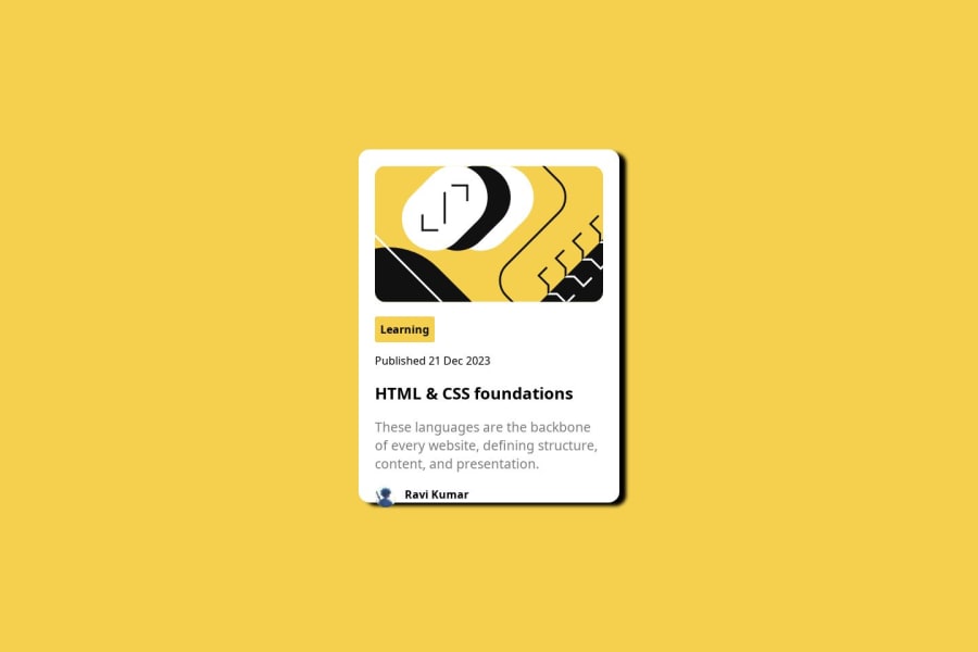
why my webpage looks diffrent on design comparision than actual website
0@dylan-dot-cPosted 4 months ago@SecretsofArea51 Well done with this challenge.
For the design comparison, you used a fixed height of 100vh on the div so I guess maybe the screenshot that it took was too small and fell a little off the container.
Anyways here are some ways you can improve.
- Use the font that was given. You can import it from google fonts or use the file that they gave you.
- Add the 100vh on the body element as a
min-heightto make sure that if a screen size is too small it doesn't hide/overflow. - The animation is cool but make it more subtle, if you want to do a real animation, you could animate the card as a fade in or move up when the pages load if you wanna have a little fun with the animations. Just make sure when FEM takes a screenshot your animation would be completed by then(don't really know how it works).
Everything else should be good, take care.
Marked as helpful0

Please log in to post a comment
Log in with GitHubJoin our Discord community
Join thousands of Frontend Mentor community members taking the challenges, sharing resources, helping each other, and chatting about all things front-end!
Join our Discord