
Design comparison
Solution retrospective
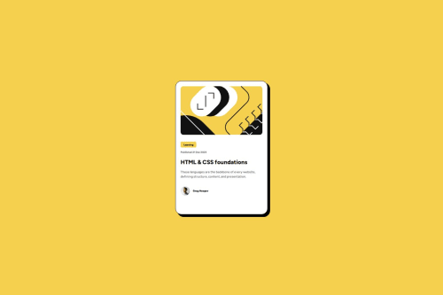
I'm satisfied with my solution to the challenge, enabling me to understand more about the box model, getting to explore the box-shadow property and understanding rem measurements although not fully
What challenges did you encounter, and how did you overcome them?I got stuck with using rem units and also struggling with the box-shadow syntaxes. I went to the MDN site to understand how the box-shadow and rem units work and also checking out some videos on YouTube concerning them.
What specific areas of your project would you like help with?I'd require some help in getting a good understanding of rem measurements and the box-shadow
Community feedback
- P@kaamiikPosted 2 months ago
Some notes to improve your code:
- You can check most of the pages and see they have a structure like this inside the
body
:
<body> <header>...<header> <main>...<main> <footer>...<footer> </body>
Based on your design you may have
header
andfooter
or not. But You should have amain
element inside your page. So after your body always wrap all of your code inside amain
element. In this design you do not needheader
andfooter
.- Your heading should be an
h2
tag because this HTML is part of a larger page and doesn't require anh1
. However, you can increase its prominence incrementally.
- Try to use a proper CSS reset at the start of your CSS style. Andy Bell and Josh Comeau both have a good one. You can simply search on the internet to find them.
- Your
font-size
andmax-width
should be inrem
unit notpx
. You can read this article about it and why you should not usepx
as a font-size.
- Use
min-height: 100vh;
instead ofheight:100vh;
.height: 100vh
strictly limits the height to the viewport size, potentially causing overflow issues if the content is larger than the viewport. On the other hand,min-height: 100vh
allows your element to grow in height if the content exceeds the viewport size.
- Never limit your width and height in a container or element or tag that contains text inside.
When you limit the width and height of elements containing text, you risk the text being cut off,
overflowing, or becoming unreadable, especially on smaller screens or when the text dynamically changes.
It's generally better to allow the container to adjust its size based on its content or set a flexible
size that can adapt to different screen sizes and text lengths. You only need
max-width
in.blog-preview-card
because it prevents elements from stretching beyond a certain point, keeping them visually appealing across different screen sizes. It ensures your design remains adaptive and doesn't get too wide on larger screens.
- Add appropriate
padding
to your body to prevent the card from sticking to the sides, top, and bottom.
Marked as helpful0 - You can check most of the pages and see they have a structure like this inside the
- @lanxCityPosted 3 months ago
The desktop size given is always confusing. I do not know if it is for the background/wrapper or the content container... if it's for the container, then the size is not practical to me
0
Please log in to post a comment
Log in with GitHubJoin our Discord community
Join thousands of Frontend Mentor community members taking the challenges, sharing resources, helping each other, and chatting about all things front-end!
Join our Discord