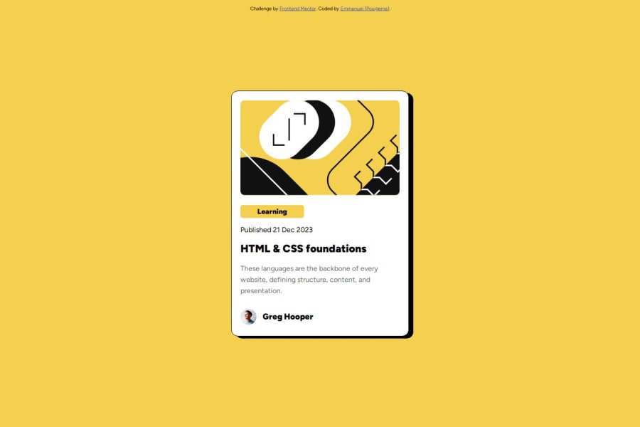
Design comparison
Solution retrospective
Je suis Heureux d'avoir terminer le mon deuxième projet. j'espère continuer sur cette lancer
Community feedback
- @YelemyahMPosted 2 months ago
Hello coder ! Well done, your work is geat !
I have a suggestion that might interest you.
-
Right now, you are using margin properties
margin-left: 35%
andmargin-top: 15%
to position the.carre
container, which is not optimal for responsive design. On smaller screens or different viewports, this can lead to misalignment or improper spacing. -
Instead, you can use Flexbox to center the
.carre
container both horizontally and vertically, which will ensure better responsiveness and centering across all devices.
/* Apply Flexbox to body for centering the main content */ body { display: flex; justify-content: center; /* Centers horizontally */ align-items: center; /* Centers vertically */ height: 100vh; /* Ensures body takes full viewport height */ margin: 0; /* Remove default margin */ background-color: #F4D04E; /* Retain background color */ } .carre { width: 100%; max-width: 400px; /* Set a max-width for better readability on large screens */ background-color: #fff; padding: 20px; border-radius: 15px; border: 1px solid black; box-shadow: 10px 5px; margin: 20px; /* Adds some spacing around the container */ }
I hope it's can help. Have a great code !
Marked as helpful0@pouigemaPosted 2 months agothanks for the advice if you have other advice I am open thank you @YelemyahM
0 -
Please log in to post a comment
Log in with GitHubJoin our Discord community
Join thousands of Frontend Mentor community members taking the challenges, sharing resources, helping each other, and chatting about all things front-end!
Join our Discord