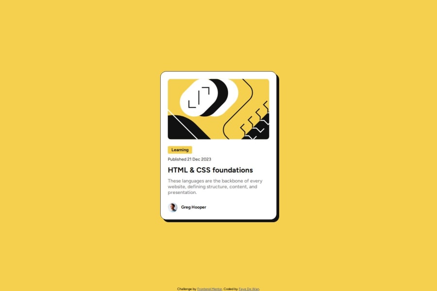
Not Found
Not Found
Not Found
Not Found
Not Found
Not Found
Not Found
Not Found
Not Found
Not Found
Not Found
Not Found
Not Found
Not Found
Not Found
Not Found
Not Found
Not Found
Not Found
Not Found

Submitted

Blog Preview Card Main

Faye 80

@FayeVinyl

Desktop design screenshot for the Blog preview card coding challenge

This is a solution for...

  • HTML
  • CSS
1newbie
View challenge

Design comparison


SolutionDesign

Solution retrospective


What are you most proud of, and what would you do differently next time?

I learned how to use clamp() to make text responsive without using media queries

What challenges did you encounter, and how did you overcome them?

I am comfortable with media queries so it was an exciting challenge to learn a new skill and apply it

What specific areas of your project would you like help with?

Any advice is always welcome

Community feedback

Raptor0x1 210

@Raptor0x1

Posted

  • You could write better alt attribute in image. Imagine there are going to many number of cards in a website. A keyboard user can't understand what the image is all about when "bold, abstract illustration in yellow, white, and black" is spoken by the text-reader. Try to write a meaningful alt text.
  • According to the figma file provided you could have increased the size of box shadow when hovered on the card. Here is a reference article.
  • Else everything looks good.

Marked as helpful

0

Please log in to post a comment

Log in with GitHub
Discord logo

Join our Discord community

Join thousands of Frontend Mentor community members taking the challenges, sharing resources, helping each other, and chatting about all things front-end!

Join our Discord