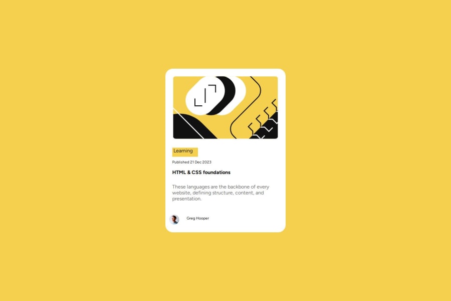
blog-preview-card-main whit css flexbox
Design comparison
Solution retrospective
What I would have done differently next time would be to create this same project with less than 100 lines of CSS code.
What challenges did you encounter, and how did you overcome them?The challenge I found was that the elements were not centered properly, I solved it by using display flex on the body with height 100vh this way they were centered properly.
Community feedback
- @majdnassifPosted 5 months ago
-
i liked how you used the variable in CSS so i have a few notes that i hope will be helpful
-
I think you have to use clamp() function to resize text size in deferent screen sizes
-
and you might forger the border and box-shadow to card-container class
-
and the text (Learning) is not centralized
-
and the text (Greg Hooper) is not bold
0 -
Please log in to post a comment
Log in with GitHubJoin our Discord community
Join thousands of Frontend Mentor community members taking the challenges, sharing resources, helping each other, and chatting about all things front-end!
Join our Discord
