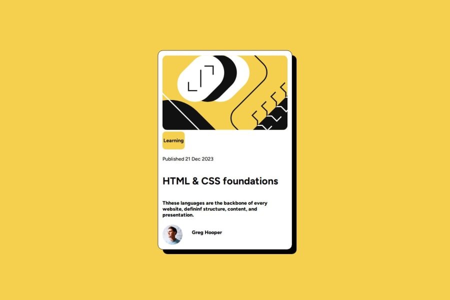
Design comparison
SolutionDesign
Please log in to post a comment
Log in with GitHubCommunity feedback
- @devjoy05
Hi, the link to your code is not working, so I'm just going to judge it based on what I see. Your solution is quite different from the design. You should check the style guide and the Figma design template as references for the font size, font weight, and spacing to make it as close to the design as possible. There's also a typo in the paragraph. You can do it! :)
Join our Discord community
Join thousands of Frontend Mentor community members taking the challenges, sharing resources, helping each other, and chatting about all things front-end!
Join our Discord
