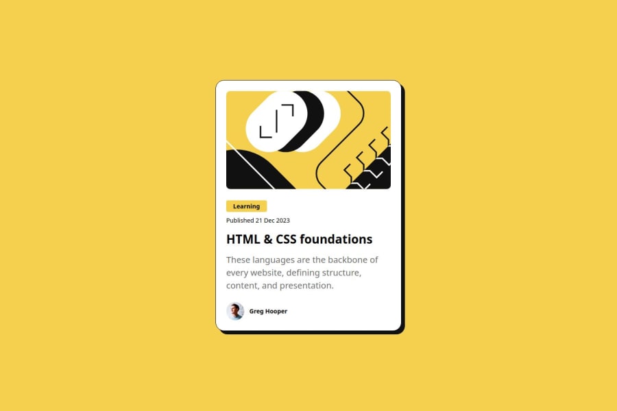


Design comparison

Solution retrospective
What are you most proud of, and what would you do differently next time? Proud of:
Clean and structured design: Your design is simple yet visually appealing, with well-placed elements like the author, the card image, and the card content. CSS skills: You've effectively used clamp() to make the text responsive and integrated custom properties (--primary, --gray-950, etc.) for a maintainable, scalable style guide. These are solid approaches to modern web design. Hover effect on the title: The hover effect that changes the color of the title to the primary yellow adds an interactive touch that enhances user experience. What I would do differently:
Improve spacing consistency: Some areas like .card_text and .card_title could have more consistent spacing across different screen sizes. You could explore using more clamp() or even CSS Grid for better control over the layout. Use more semantic HTML elements: For accessibility, try using HTML elements like , , and instead of . For example, you could use for the publication date to make it clearer that it's a date element. Image optimization: Ensure that the images are well-optimized for web performance. Using tools like WebP images or lazy loading (loading="lazy") could improve performance.
What challenges did you encounter, and how did you overcome them?Challenges Encountered and How I Overcame Them
- Positioning and Layout Adjustments:
One of the main challenges was getting the right layout and positioning of elements, especially ensuring that the design looks consistent across different screen sizes.
Solution: I used flexbox to create a flexible layout and ensure that the elements aligned correctly, centering both vertically and horizontally. I also made use of clamp() for responsive typography, allowing text to adjust seamlessly across different devices without needing separate media queries for font sizes.
- Managing Spacing and Consistency:
Another challenge was keeping spacing consistent between elements, especially when dealing with margins and padding, which can become tricky with more complex designs.
Solution: I created custom CSS variables (--spacing-1, --spacing-2, etc.) to handle spacing. This made it easier to tweak the spacing later on and ensured consistency throughout the design. Having these variables reduced the need for hardcoded values and kept the styling DRY (Don’t Repeat Yourself).
- SVG and Image Integration:
Handling the zigzag patterns, which were SVG images, required careful manipulation to get them aligned as desired without disrupting the other layout components.
Solution: I used absolute positioning for the SVG images within their container and fine-tuned the position using top, right, transform, etc. This allowed me to overlay the images in the exact spot without affecting the flow of the content around them.
- Accessibility Considerations:
Ensuring accessibility was a challenge because it’s easy to overlook small details like color contrast and semantic HTML.
Solution: I used semantic HTML where appropriate (like with alt text) and ensured high-contrast colors between text and background for readability. In the future, I would also look into improving the navigation for screen readers.
Community feedback
- P@MikDra1Posted 6 months ago
Well done, here are some things to review 😊:
-
REM for Units: It's best to use
remfor all units instead ofpx, as this ensures scalability and consistency in spacing and font sizes based on the user's root font size. It helps improve accessibility. -
Semantic HTML: Consider ensuring all elements are wrapped in semantic HTML tags like
<main>,<section>, and<article>to enhance the structure and SEO-friendliness of the page. -
External CSS File: Moving all styles into an external CSS file keeps the structure clean and makes maintenance easier. Inline styles are harder to manage, especially as the project grows.
-
CSS Reset: Consider adding a full modern CSS reset (like normalize.css or custom resets at the beginning of the stylesheet) to ensure consistent styling across different browsers. Here is a link to one I really like.
-
Clamp() for Responsiveness: Use the
clamp()function for fluid typography and spacing, allowing elements to resize smoothly between a minimum and maximum value based on the viewport size (e.g.,font-size: clamp(1rem, 2vw, 1.5rem)). -
Responsive Card: To make the card responsive, ensure the layout uses
flexorgridcombined with max-width instead of fixed width values. This will make the design more flexible and adapt better to different screen sizes. -
Use max-width/min-width and max-height/min-height: Instead of using fixed
widthandheight, opt formax-widthormin-widthto allow the elements to resize smoothly on different screen sizes, improving overall responsiveness.
Hope you found this comment helpful 💗💗💗
Good job and keep going 😁😊😉
Marked as helpful0 -
- P@StroudyPosted 6 months ago
Awesome job tackling this challenge! You’re doing amazing, and I wanted to share a couple of suggestions that might help refine your approach…
-
Greg Hooper should be wrapped in a HTML tag like a
<p>, -
These
<span>should really have semantic tags like headings (<h1> to <h6>) and paragraphs (<p>) convey structure and meaning to content, improving accessibility, SEO, and readability by helping search engines and screen readers interpret the content.<span class="card_tag preset-4">Learning</span> -
Line height is usually unitless to scale proportionally with the font size, keeping text readable across different devices. Best practice is to use a unitless value like
1.5for flexibility. Avoid using fixed units likepxor%, as they don't adapt well to changes in font size or layout. -
Developers should avoid using pixels (
px) because they are a fixed size and don't scale well on different devices. Instead, useremorem, which are relative units that adjust based on user settings, making your design more flexible, responsive, and accessible. For more information check out this, Why font-size must NEVER be in pixels or this video by Kevin Powell CSS em and rem explained.- Another great resource for px to rem converter.
You’re doing fantastic! I hope these tips help you as you continue your coding journey. Stay curious and keep experimenting—every challenge is an opportunity to learn. Have fun, and keep coding with confidence! 🌟
Marked as helpful0 -


Please log in to post a comment
Log in with GitHub
Join our Discord community
Join thousands of Frontend Mentor community members taking the challenges, sharing resources, helping each other, and chatting about all things front-end!
Join our Discord