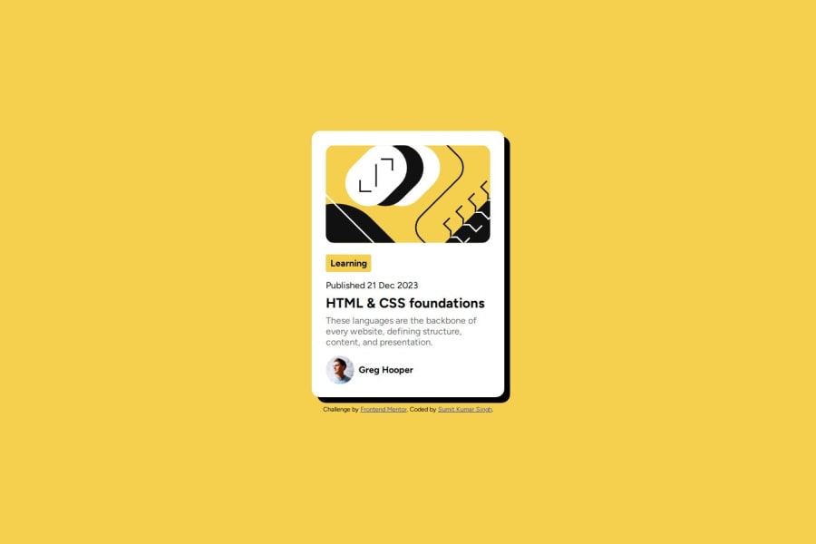


Design comparison
SolutionDesign

Solution retrospective
What are you most proud of, and what would you do differently next time?
I am most proud about completing it after facing a setback, I was using height relative to viewport resulting in overflow of card content. Next time I will learn where to use which type of unit to use and try to reduce my code further.
What challenges did you encounter, and how did you overcome them?One of few challenges I encountered were not understanding when to use fixed pixel unit and when to use relative unit. I learned and fixed it with experiment.
What specific areas of your project would you like help with?I would like help with how to make my code smaller and how to achieve minute details in design and feedback about elements size and units.
Community feedback
Please log in to post a comment
Log in with GitHubJoin our Discord community
Join thousands of Frontend Mentor community members taking the challenges, sharing resources, helping each other, and chatting about all things front-end!
Join our Discord