Not Found
Not Found
Not Found
Not Found
Not Found
Not Found
Not Found
Not Found
Not Found
Not Found
Not Found
Not Found
Not Found
Not Found
Not Found
Not Found
Not Found
Not Found
Not Found
Not Found

Submitted

blog-preview-card-main

@LaurenAMolloy

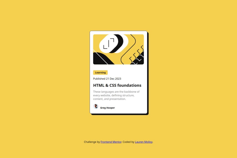
Desktop design screenshot for the Blog preview card coding challenge

This is a solution for...

  • HTML
  • CSS
1newbie
View challenge

Design comparison


SolutionDesign

Solution retrospective


What are you most proud of, and what would you do differently next time?

I am proud of using css variables for the first time and using Flexbox to successfully align the containers and elements. Next time I would spend a few more minutes planning out the layout and considering which settings I will use. I would like to get more efficient and practice more.

What challenges did you encounter, and how did you overcome them?

I had a few challenges, such as issues with aligning the text. I found the answer on youtube.

What specific areas of your project would you like help with?

I would like feedback on the use of semantic html and know if my css is well organised.

Community feedback

MikDra1 6,090

@MikDra1

Posted

Nice one 😀,

Here are some thing to review:

  • Use Semantic Tags: Replace generic <div> tags with more meaningful tags like <article> or <section> for better content structure.

  • Image Wrapper: Use the <figure> tag instead of <div class="img-box"> to semantically group the image, especially if a caption is included.

  • Publication Date: Replace <p class="card-date"> with the <time> tag to better represent the date.

  • Attribution Section: Consider using a <footer> tag for the attribution section to enhance document structure and semantics.

  • Improved Accessibility: These changes enhance accessibility, SEO, and overall readability.

Hope you found this comment helpful 💗💗💗

Good job and keep going 😁😊😉

Marked as helpful

1

@LaurenAMolloy

Posted

Thanks for the advice! Very useful. I will be sure to consider the points made in my next project @MikDra1

0

@TedJenkler

Posted

Hi Lauren,

Nice project! As mentioned in the previous feedback, try to avoid using <div> elements where possible by replacing them with semantic HTML elements. This practice not only improves accessibility but also enhances SEO. If you can't find a suitable semantic element to use, consider adding aria-label="" attributes to your <div> elements to provide descriptions for screen readers.

Hope this helps!

Best, Teodor

Marked as helpful

0

@LaurenAMolloy

Posted

@TedJenkler Great advice. I will consider this for future projects.

1
Joshua 60

@BravinJoshua

Posted

Try using svh instead of vh since svh reflects the smallest possible viewport height that is visible to the user. It should kill the scrolling though

Marked as helpful

0

@LaurenAMolloy

Posted

Will check this out! Thanks @BravinJoshua

0

Please log in to post a comment

Log in with GitHub
Discord logo

Join our Discord community

Join thousands of Frontend Mentor community members taking the challenges, sharing resources, helping each other, and chatting about all things front-end!

Join our Discord