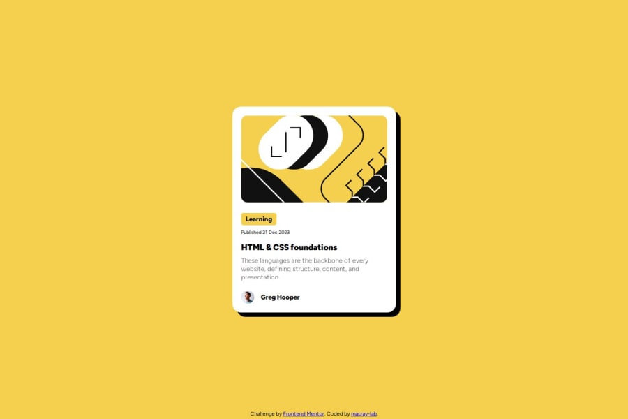
Design comparison
SolutionDesign
Solution retrospective
What are you most proud of, and what would you do differently next time?
I am proud of the improvement in my css for now but I look foward in learning more.
Please log in to post a comment
Log in with GitHubCommunity feedback
No feedback yet. Be the first to give feedback on MacRay-lab's solution.
Join our Discord community
Join thousands of Frontend Mentor community members taking the challenges, sharing resources, helping each other, and chatting about all things front-end!
Join our Discord
