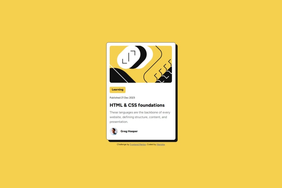
Design comparison
Solution retrospective
I did okay job on this project.Next time i would like to maybe look for simple way and less code to design a button.
What challenges did you encounter, and how did you overcome them?I had a challenge with git how to add files and to push the files after changing the commits and also i had problem with live url. but i read two-three posts for 2 or 3 time i understood and solved it.
What specific areas of your project would you like help with?I would like help on how to design the button in this project with less code than i used maybe if there is different way. I would like to use more flex or grid in styling the pages. Can you suggest where can i use the flex or grid in any way in this project. Thank you for your feedback.
Community feedback
Please log in to post a comment
Log in with GitHubJoin our Discord community
Join thousands of Frontend Mentor community members taking the challenges, sharing resources, helping each other, and chatting about all things front-end!
Join our Discord
