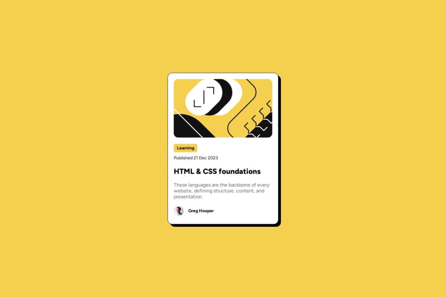
Design comparison
SolutionDesign
Community feedback
- @aguilarjavierPosted 5 months ago
Looks great you go the sizing and overall look down. There is a small on hover effect that is missing from the original design. It's simple it would look something like this.
.title:hover{
    color: #F4D04E;
    cursor: pointer;
}
Github link doesn't work at the moment so I can't see how you did your styling.
Overall looks great!
Marked as helpful0@thaliawoodsPosted 5 months ago@aguilarjavier Thank you very much! I am going to try this :))))
0
Please log in to post a comment
Log in with GitHubJoin our Discord community
Join thousands of Frontend Mentor community members taking the challenges, sharing resources, helping each other, and chatting about all things front-end!
Join our Discord
