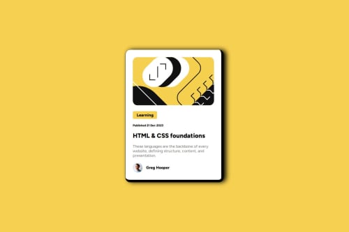
Submitted over 1 year agoA solution to the Blog preview card challenge
BLOG-PREVIEW-CARD-MAIN
@RogerTito455

Solution retrospective
What are you most proud of, and what would you do differently next time?
Well, I think that I developed an hability to make this kind of css html project so easily. I would like to try new things like trying to make it good.
What challenges did you encounter, and how did you overcome them?Well, I didn't know how to make the borders of the box and the shadow but I overcome using a little bit of chatgpt and gave me an advice.
What specific areas of your project would you like help with?The same as the previous one, I really want to know if my code can be smaller to make it efficient.
Code
Loading...
Please log in to post a comment
Log in with GitHubCommunity feedback
No feedback yet. Be the first to give feedback on RogerTito455's solution.
Join our Discord community
Join thousands of Frontend Mentor community members taking the challenges, sharing resources, helping each other, and chatting about all things front-end!
Join our Discord