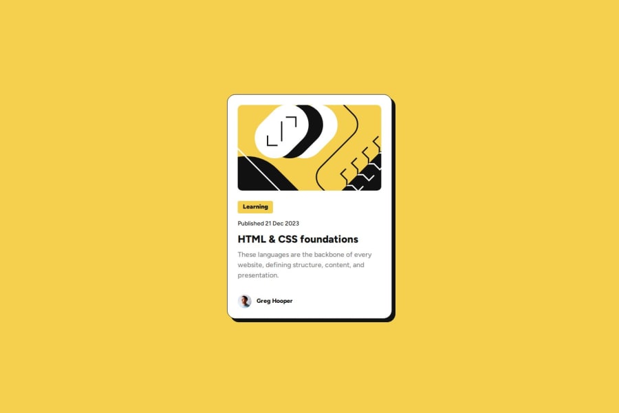
Design comparison
SolutionDesign
Solution retrospective
What are you most proud of, and what would you do differently next time?
Have completed, with ease
What specific areas of your project would you like help with?the space between the TAPs could be improved
Community feedback
- @pettikPosted about 1 year ago
Your HTML and CSS code is well-structured and clean, which is great! Here's some feedback:
Positive Points:
- Semantic HTML: You've used semantic HTML tags like
<header>,<section>, and<article>, which helps with accessibility and SEO. - CSS Variables: You've used CSS variables for colors, which makes it easier to maintain and change the color scheme if needed.
- Responsive Design: You've used media queries to make your design responsive, which is a crucial aspect of modern web design.
- Forked CSS files: for styles, media and fonts - great idea!
Areas for Improvement:
- Alt Text: The
altattribute for the image could be more descriptive. Instead of "Avatar de Imagem", consider something like "Profile picture of Greg Hooper". This would be more helpful for screen readers. - Font Loading: You've loaded multiple fonts using
@font-face. Consider using a service like Google Fonts, which can make font loading more efficient and easier to manage. - CSS Organization: While your CSS is fairly well-organized, you could improve it by grouping related styles together or commenting sections of your CSS for better readability.
- Missing description in Github Readme.md file
Overall, great job!👍 Keep practicing to continue improving your skills. 🚀
Marked as helpful0 - Semantic HTML: You've used semantic HTML tags like
Please log in to post a comment
Log in with GitHubJoin our Discord community
Join thousands of Frontend Mentor community members taking the challenges, sharing resources, helping each other, and chatting about all things front-end!
Join our Discord
