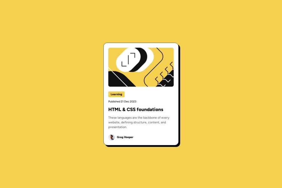
Design comparison
Please log in to post a comment
Log in with GitHubCommunity feedback
- P@Stroudy
Your CSS is great, Well done on getting this far! You’re clearly putting in the effort, and it shows. Just a few things I noticed that could enhance your solution…
-
These should probably be a
<h1>or<p>tag since they have more of a semantic meaning,<div>have no semantic meaning, -
Setting
font-size: 62.5%can affect accessibility by reducing the default browser font size, potentially making text harder to read for users with visual impairments. This does make it easier to work out the relative units but at what cost?
It was hard for me to find any feedback I could provide, You’re doing fantastic! I hope these tips help you as you continue your coding journey. Stay curious and keep experimenting—every challenge is an opportunity to learn. Have fun, and keep coding with confidence! 🌟
Marked as helpful -
Join our Discord community
Join thousands of Frontend Mentor community members taking the challenges, sharing resources, helping each other, and chatting about all things front-end!
Join our Discord
