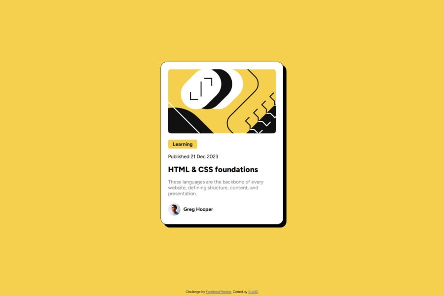
Blog Preview Card made with HTML and CSS in VSCode


Design comparison

Solution retrospective
This was similar to my first challange and i'm happy that much of what i learned during it stick with me during this one. I thought that the shadow of the card would be difficult to make, but to my surprise it was very simple, so that's something i'm happy with.
What challenges did you encounter, and how did you overcome them?The 'Learning' Tag took me some time to figure out how to do properly. Looking back with hindsight, it shouldn't have take me soo long to do it. I'll make sure to remember this in future challanges.
What specific areas of your project would you like help with?my styling could be a bit more organized. I think i could have made it shorter and easier for other people to understand it. If anyone see any area for improvement, I'm open ears.
Community feedback
Please log in to post a comment
Log in with GitHubJoin our Discord community
Join thousands of Frontend Mentor community members taking the challenges, sharing resources, helping each other, and chatting about all things front-end!
Join our Discord