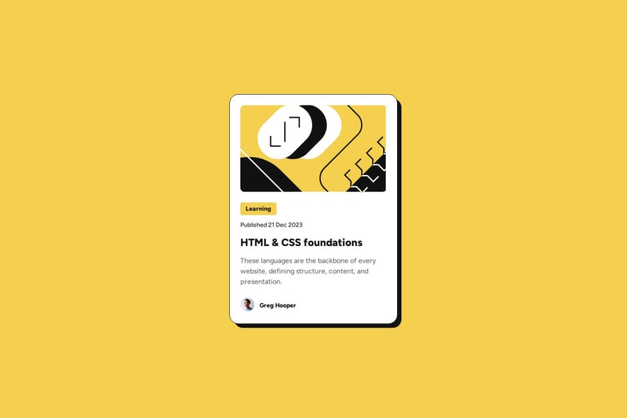
Design comparison
Solution retrospective
I'm happy with this one being a close reproduction of the original, with some additional tweaks such as using a hover transition rather than an immediate colour switch. Next time I'm going to think a bit more in advance on what custom variables and classes I want to set up in advance to make it easier to keep the code consistent.
What challenges did you encounter, and how did you overcome them?I think there's a better solution for putting the right gaps between the elements other than putting margins under each element (without having to use grid or flex for such a simple design), though it did give me my first use case for the all-children selector, which was a good learning.
What specific areas of your project would you like help with?Nothing specific this time.
Community feedback
- @yyuntzpanPosted 8 months ago
Your layout matches the design very well, that's impressive!
Next time, you could try the challenge of adapting font sizes for different devices without using @media queries.
0
Please log in to post a comment
Log in with GitHubJoin our Discord community
Join thousands of Frontend Mentor community members taking the challenges, sharing resources, helping each other, and chatting about all things front-end!
Join our Discord
