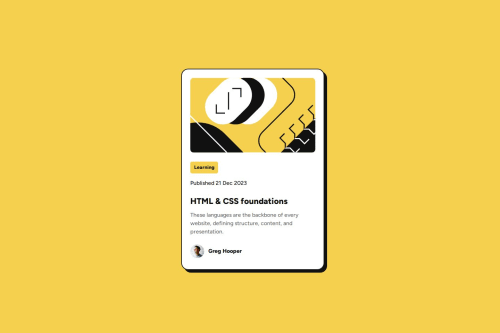
Not Found
Not Found
Not Found
Not Found
Not Found
Not Found
Not Found
Not Found
Not Found
Not Found
Not Found
Not Found
Not Found
Not Found
Not Found
Not Found
Not Found
Not Found
Not Found
Not Found

Submitted

Blog Preview Card

@moonji-spoonji

Desktop design screenshot for the Blog preview card coding challenge

This is a solution for...

  • HTML
  • CSS
1newbie
View challenge

Design comparison


SolutionDesign

Solution retrospective


What are you most proud of, and what would you do differently next time?

I'm proud of how it turned out but I don't know if it's the same size as the design provided. I tried to use the Figma file CSS rules as best I could but I did tweak them a bit based on what I saw. I am also proud of myself for trying out custom CSS variables.

What challenges did you encounter, and how did you overcome them?

I encountered the challenge of sizing, which seems to be a theme lol but I hope to soon overcome it. I also had a challenge with keeping the footer/attribution part at the bottom of the page, so I just removed/didn't include it.

What specific areas of your project would you like help with?

I would like help with making my mobile design/solution as close to the Figma design. Also the best way to use an image (when to include it in HTML or in CSS as a background-image) and how to position it/show a specific part of it if needed.

Community feedback

P
Steven Stroud 9,380

@Stroudy

Posted

Awesome job tackling this challenge! You’re doing amazing, and I wanted to share a couple of suggestions that might help refine your approach…

  • For future project, You could downloading and host your own fonts using @font-face improves website performance by reducing external requests, provides more control over font usage, ensures consistency across browsers, enhances offline availability, and avoids potential issues if third-party font services become unavailable. Place to get .woff2 fonts

  • Developers should avoid using pixels (px) because they are a fixed size and don't scale well on different devices. Instead, use rem or em, which are relative units that adjust based on user settings, making your design more flexible, responsive, and accessible. For more information check out this, Why font-size must NEVER be in pixels or this video by Kevin Powell CSS em and rem explained.- Another great resource for px to rem converter.

  • Line height is usually unitless to scale proportionally with the font size, keeping text readable across different devices. Best practice is to use a unitless value like 1.5 for flexibility. Avoid using fixed units like px or %, as they don't adapt well to changes in font size or layout.

  • Using max-width: 100% or min-width: 100% is more responsive than just width: 100% because they allow elements to adjust better to different screen sizes. To learn more, check out this article: responsive-meaning.

  • Using rem or em units in @media queries is better than px because they are relative units that adapt to user settings, like their preferred font size. This makes your design more responsive and accessible, ensuring it looks good on different devices and respects user preferences.

  • Using a full modern CSS reset is beneficial because it removes default browser styling, creating a consistent starting point for your design across all browsers. It helps avoid unexpected layout issues and makes your styles more predictable, ensuring a uniform appearance on different devices and platforms, check out this site for a Full modern reset

I hope you found this advice helpful! Keep up the great work, You’re doing amazing, and I can’t wait to see what you create next. Happy coding! 🚀

Marked as helpful

1

@moonji-spoonji

Posted

@Stroudy oh wow! Thank you so much for your feedback, this is all so helpful! I'll definitely use those resources and implement your advice, I really appreciate it :)

1
P
Steven Stroud 9,380

@Stroudy

Posted

Hey @moonji-spoonji, No problem, Its not a race so take your time, Build a strong foundation and ask the right questions, I encourage you to do code reviews to and learn from other peoples solutions. You got this 💪

1

@JosephEnigmatic

Posted

The card should have a container in the main tag

0

@moonji-spoonji

Posted

Oh like using a container for the card itself, @JosephEnigmatic?

1

@JosephEnigmatic

Posted

@moonji-spoonji yeah, the main would be for semantic purposes only

Marked as helpful

1

@moonji-spoonji

Posted

@JosephEnigmatic ahh okay thank you!

1

Please log in to post a comment

Log in with GitHub
Discord logo

Join our Discord community

Join thousands of Frontend Mentor community members taking the challenges, sharing resources, helping each other, and chatting about all things front-end!

Join our Discord