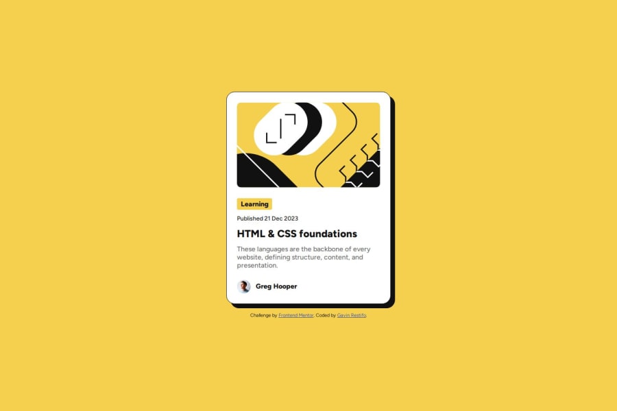
Design comparison
Solution retrospective
I am getting more comfortable with sketching out the structure of HTML code and setting up the proper architecture from the Figma files.
What challenges did you encounter, and how did you overcome them?I had to figure out how to use flex containers and gaps to properly separate items.
Community feedback
- @bmeinert8Posted about 1 month ago
Your finish product looks great, you nailed the desktop version of the design. A few things I noticed from the design that are missing that you may go back in and add if you'd like.
- The first thing I noticed missing was when hovering over the page the box shadow hover effect was not present such as in the design.
- Another missing piece I noticed was also with the hover effect. You had the main title text change color, which is excellent, but the cursor did not change to a pointer.
- There are some very slight changes to sizing in the font and container itself from the desktop to the mobile version of the challenge that I didn't see.
Again, these are just things that I noticed, and you don't need to go in and make these changes if you don't want to. All and all I think you did a great job! Your code looks good and the design looks right. Keep up the good hard work my friend :)
0@gjrestifoPosted about 1 month ago@bmeinert8 Thanks for your feedback! What do you mean by the box shadow hover effect? I might have missed some detail in the project description.
0 - @tasosbeastPosted about 1 month ago
good job ! you have a bit more margin on date and on title but overall good job
0
Please log in to post a comment
Log in with GitHubJoin our Discord community
Join thousands of Frontend Mentor community members taking the challenges, sharing resources, helping each other, and chatting about all things front-end!
Join our Discord