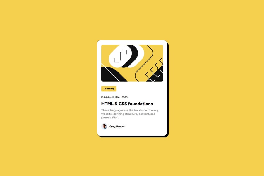
Design comparison
Solution retrospective
I'm proud that I could even make it.🤣
What challenges did you encounter, and how did you overcome them?Dealing with media query, but it's not that hard actually ig.
What specific areas of your project would you like help with?My css file looks a mess, how can I make it more clear for like someone who is working with me in a project?
Please log in to post a comment
Log in with GitHubCommunity feedback
- @Dev-MV6
Hi there, good job on completing the challenge.
Code readability is essential in collaborative environments. One piece of advice I can give you to improve is to start using more descriptive names for your classes.
This will help you when working on larger projects where the style sheets are much longer. If you develop the habit of using descriptive class names for your elements, you won't get lost if you ever need to scale your code, and it will certainly help other developers understand it more easily.
For example, instead of using class-names like
container,content,author, try to think of the element you are styling as a component and the elements inside that element (children elements) as parts of that component.This way,
- Instead of
.container, you can use.cardfor the main container, now it's a component - Since
.contentis part of the.cardcomponent you can use.card-content .authorwould be.card-author- Instead of using
.text h1to select the card title you can assign a class like.card-content__titleto theh1element an use it as selector in your CSS
Don't get frustrated if you struggle with finding the best descriptive class name for your elements at first, you'll better at that with time.
Another thing you can do to improve your code readability is to write your CSS selectors from top to bottom, in hierarchical order so the parent elements of the component go first, and the sibling elements just like they are positioned in the HTML tree.
For example, in your code the
.boxshould go before the.authorselector because the.boxelement is positioned before the.authorelement in the card.Hope you find this helpful 👍
Marked as helpful - Instead of
- @R3ygoski
Olá novamente @mendesdomingosdev, parabéns por ter concluído mais um projeto, ficou simplesmente perfeito.
Sobre o seu CSS, sinceramente, eu não achei ele bagunçado, mas uma dica seria de você separar em seções, por exemplo, no topo vem o seletor global (*), logo em seguida vem os seletores de tags (h1, h2, body, etc...), logo em seguida os seletores de classe e por último os seletores de id. Outra coisa que pode ajudar é colocar o reset em um arquivo CSS separado, chamado
reset.css, e colocar as media query em um arquivo separado chamadoresponsive.css.Outra coisa que você pode achar interessante, seria utilizar o Sass/Scss, que é um pré-processador de CSS, que funciona em perfeição com a metodologia BEM.
Eu pessoalmente prefiro o Scss pois ele é mais próximo do CSS do que o Sass em si.
Abaixo alguns links sobre Sass e BEM:
E novamente, parabéns pelo seu projeto, continue assim. Caso algo que eu tenha dito não tenha ficado claro, por favor, pergunte aqui embaixo que tentarei responder a melhor forma possível.
Marked as helpful
Join our Discord community
Join thousands of Frontend Mentor community members taking the challenges, sharing resources, helping each other, and chatting about all things front-end!
Join our Discord
