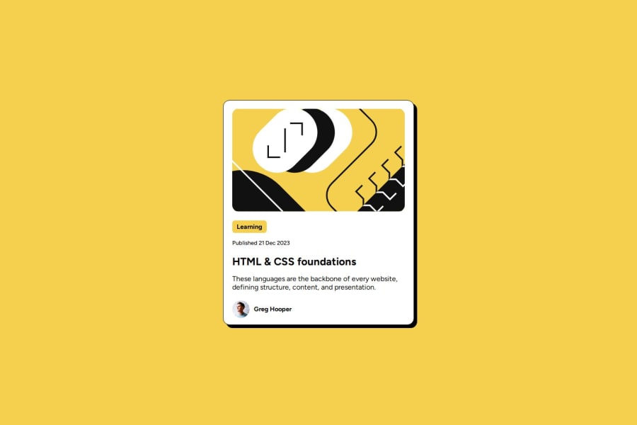
Blog preview card


Design comparison

Solution retrospective
I’m most proud of the responsive design and interactive elements I implemented in the blog preview card. The use of Flexbox for layout allowed for a clean and adaptive structure, ensuring that the card looks great on various screen sizes. Additionally, the hover effects provide a nice touch of interactivity, making the card feel engaging. Integrating Google Fonts added an extra layer of visual appeal, enhancing the overall aesthetics of the project.
What challenges did you encounter, and how did you overcome them?- What would you do differently next time? Next time, I would focus more on accessibility features, such as ensuring that all interactive elements are keyboard-navigable and have appropriate ARIA labels. I would also consider optimizing the performance by minimizing the size of the images and potentially using CSS variables for consistent theming throughout the card. Lastly, I might explore using a CSS preprocessor like SASS to manage styles more effectively as the project grows in complexity.
I would appreciate feedback on my responsive design choices and any suggestions for improving accessibility in my project. Additionally, insights on best practices for optimizing performance and any tools or techniques for managing CSS in larger projects would be very helpful.
Community feedback
Please log in to post a comment
Log in with GitHubJoin our Discord community
Join thousands of Frontend Mentor community members taking the challenges, sharing resources, helping each other, and chatting about all things front-end!
Join our Discord