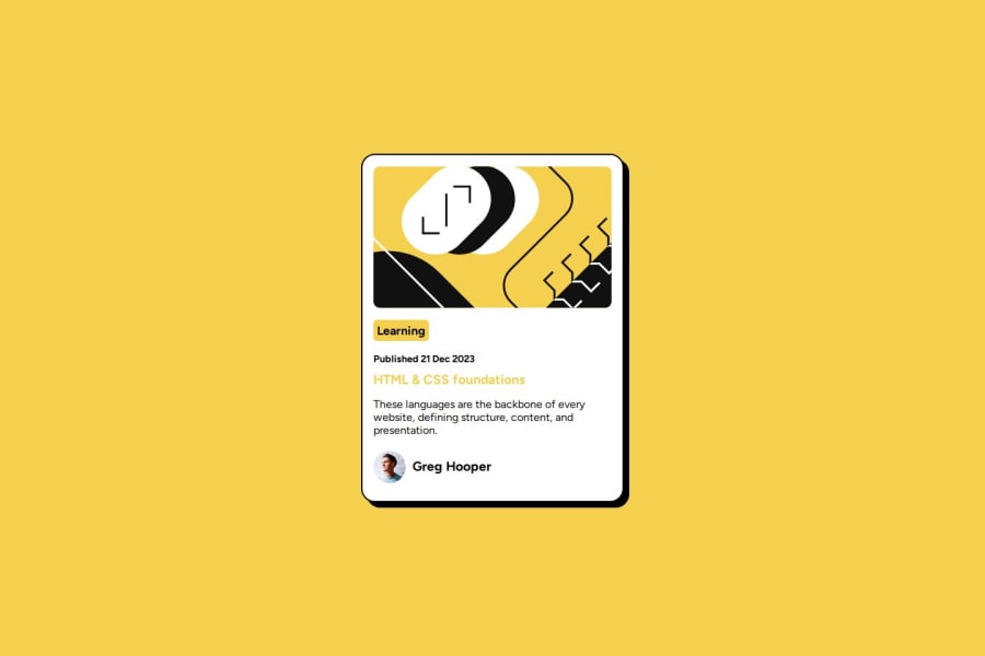
Design comparison
SolutionDesign
Solution retrospective
What are you most proud of, and what would you do differently next time?
I always focus on using vanilla CSS and try to learn new things.
What challenges did you encounter, and how did you overcome them?I had experimented with the margin and padding to add seperation between elements.
What specific areas of your project would you like help with?Please let me know if there are ways to improve?
Community feedback
Please log in to post a comment
Log in with GitHubJoin our Discord community
Join thousands of Frontend Mentor community members taking the challenges, sharing resources, helping each other, and chatting about all things front-end!
Join our Discord
