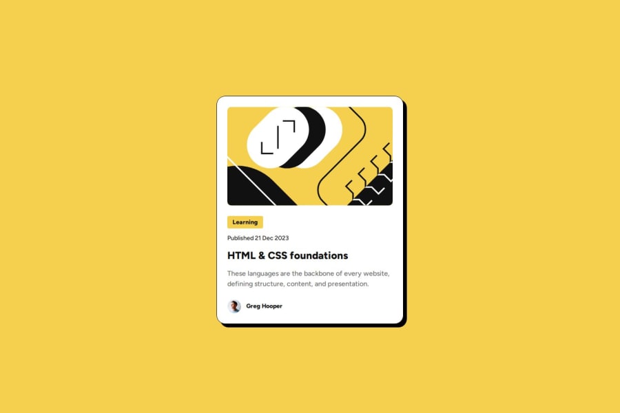
Design comparison
Solution retrospective
I am most proud of the hover function. I haven't touched any html and css before, and yet it look so good!
What challenges did you encounter, and how did you overcome them?Eh, nothing I guess. Thanks to Mr. Chad Gippity I am able to solve most of the problems. I think the hardest part of this is to determine the font size for desktop and phone screen.
How am I supposed to dynamically figure that out?? Turns out you can use clamp() or em, rem, or something like that.
What specific areas of your project would you like help with?I'm not sure..
Community feedback
- P@codigotinPosted 9 months ago
I would recommend you to visualize the design in Figma, there you can see the specific sizes, font and other elements. In general it is ok, but you can still improve a lot of things in the design.
0
Please log in to post a comment
Log in with GitHubJoin our Discord community
Join thousands of Frontend Mentor community members taking the challenges, sharing resources, helping each other, and chatting about all things front-end!
Join our Discord
