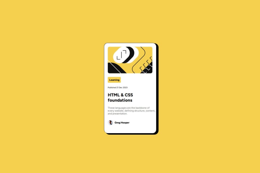


Design comparison

Solution retrospective
Most proud of getting the visuals very similar to the original design. It looked challenging at first, but once I figured out how to correctly add box shadows with the correct offset, I was able to make the card look how I wanted.
What challenges did you encounter, and how did you overcome them?The biggest challenge was trying to eyeball the designs and get them to look similar to the original design. What I ended up doing was setting the design as the background to my HTML page, and then comparing my card dimensions to that of the actual design.
What specific areas of your project would you like help with?I would like feedback on my responsive layout/design. The card only looks as intended in full screen on a 16:9 aspect ratio screen. However, when I narrow the viewport, the card doesn't look as clean. What is a good way to handle this for a design where the elements will shift a lot depending on how narrow or wide the viewport is?
Community feedback
- @isushmoyPosted 12 months ago
It's great to hear that you're proud of achieving visuals similar to the original design, especially overcoming challenges with box shadows. To improve next time, consider creating a more systematic approach for achieving consistency in design elements.
For handling responsive layouts, consider using CSS media queries to adjust the layout and styling based on different viewport sizes. You can set specific breakpoints where the layout shifts, ensuring that elements adapt well to various screen sizes. Additionally, using relative units like percentages or viewport units can help maintain consistency across different devices. Testing on multiple devices and screen sizes can also provide valuable insights into how your design responds to different environments. Overall, focusing on responsiveness will enhance the user experience across various devices and screen sizes.
0

Please log in to post a comment
Log in with GitHub
Join our Discord community
Join thousands of Frontend Mentor community members taking the challenges, sharing resources, helping each other, and chatting about all things front-end!
Join our Discord