

Design comparison

Solution retrospective
What I'm most proud of
I'm proud of how I was able to complete the work because I understood the concepts behind it. It felt rewarding to apply what I had learned and see the results come together.
What I would do differently next time
Next time, I would try to focus more on refining my design and experimenting with advanced CSS techniques like CSS Grid, which I haven't explored much yet.
What challenges did you encounter, and how did you overcome them?Challenges Encountered
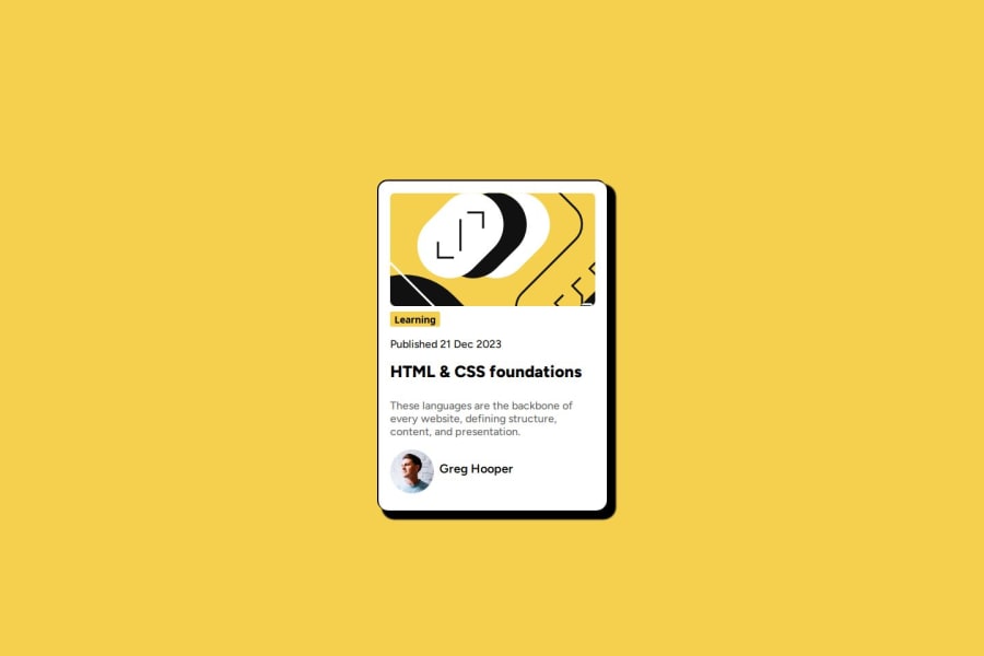
Initially, I used border-radius on the sides of the design to round the corners, but I realized that it didn't match the design specifications exactly. The effect wasn't the same as what was shown in the design mockup.
To overcome this, I researched the correct technique and discovered that box-shadow would be the better approach to achieve the desired visual effect. After making the change, the design matched the intended look much better.
Areas I Would Like Help With
One specific area I would like help with is improving the responsiveness of my design, especially on smaller screens. While I used flexbox for layout, I feel that the design could be better optimized for mobile devices. I would love to get feedback on using advanced Flexbox techniques to enhance the layout further.
Additionally, I want to explore CSS Grid for creating more complex, two-dimensional layouts. I haven't used CSS Grid extensively yet, and I am interested in understanding how to implement it effectively in this project to improve the overall structure and design.
Lastly, I am also interested in getting feedback on my use of box-shadow for visual depth. I am not sure if the shadow effect is consistent across all screen sizes, and I would appreciate any suggestions for improving its appearance.
Community feedback
- P@eminahadziccPosted 5 months ago
It looks good! Your use of the box-shadow is exactly as it should be, looking at the design. The solution does differ a bit from the design, looking at e.g. the distance between texts or the size of the profile picture so that would be something to look out for, but you already said that yourself in the description so it's good that you're aware. The code is readable and the layout looks good on different screen sizes.
Marked as helpful0@AdhizahPosted 5 months ago@eminahadzicc Thank you so much for taking the time to review my work and for your kind words about the box-shadow and the overall layout! I really appreciate your feedback on the differences, like the text spacing and profile picture size—I'll definitely work on improving those details. I'm glad to hear the layout looks good on different screen sizes, and your encouragement means a lot. Thanks again for your helpful insights!
0

Please log in to post a comment
Log in with GitHubJoin our Discord community
Join thousands of Frontend Mentor community members taking the challenges, sharing resources, helping each other, and chatting about all things front-end!
Join our Discord