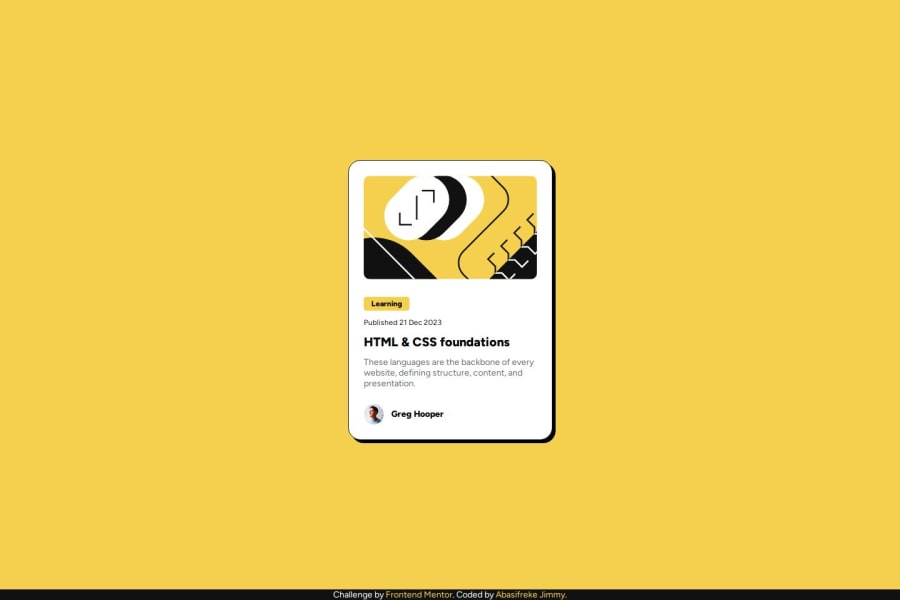
Design comparison
SolutionDesign
Community feedback
- @CamperbugPosted 7 months ago
Looks really good, I am a newbie as well.
It is interesting to note that you used flex box for the main element, I used the same display: flex, justify-content: center, Align-items: center, on the body element to center the whole thing. both work fine just an interesting observation.
Congratulations on finishing the task. 😀🎉
I hope you found this helpful.
Marked as helpful0
Please log in to post a comment
Log in with GitHubJoin our Discord community
Join thousands of Frontend Mentor community members taking the challenges, sharing resources, helping each other, and chatting about all things front-end!
Join our Discord
