Design comparison
SolutionDesign
Solution retrospective
What are you most proud of, and what would you do differently next time?
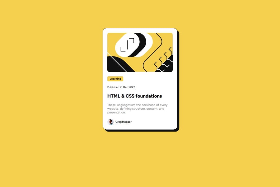
I believe it look exactly like what was asked, because of the Figma file. And the fact that i used flexbox with a space evenly instead of using margin-top.
What challenges did you encounter, and how did you overcome them?Didn't really encounter trubles.
What specific areas of your project would you like help with?I want to be able to make it without using static numbers for my width and height.
Community feedback
Please log in to post a comment
Log in with GitHubJoin our Discord community
Join thousands of Frontend Mentor community members taking the challenges, sharing resources, helping each other, and chatting about all things front-end!
Join our Discord
