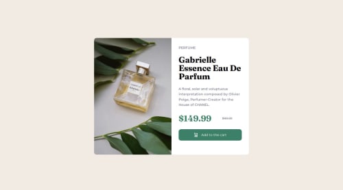
Submitted over 1 year agoA solution to the Product preview card component challenge
Blog preview card - HTML/CSS

@P-Mingi
Solution retrospective
What are you most proud of, and what would you do differently next time?
nthg
What challenges did you encounter, and how did you overcome them?I wanted to make it without using media query (only for the pic) and using flex wrap for exemple, but i didn't managed to do it, i think it's impossible, or i need function that i don't know yet.
What specific areas of your project would you like help with?How to make it with less @media query
Code
Loading...
Please log in to post a comment
Log in with GitHubCommunity feedback
No feedback yet. Be the first to give feedback on P-Mingi's solution.
Join our Discord community
Join thousands of Frontend Mentor community members taking the challenges, sharing resources, helping each other, and chatting about all things front-end!
Join our Discord